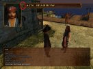
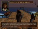
I thought about making the borders of the whole top part a bit thinner, because it looks kind of weird compared to the rather slim dialog box. Should be possible for the portrait too.
For the ornaments, good question. I added them inside the name window so it matches better with the portrait. I have no idea though, why the top border of the dialog part gets squeezed that much, while the rest of it gets stretched like there were no tomorrow.
For the ornaments, good question. I added them inside the name window so it matches better with the portrait. I have no idea though, why the top border of the dialog part gets squeezed that much, while the rest of it gets stretched like there were no tomorrow.


