• New Horizons on Maelstrom
    Maelstrom New Horizons


    Visit our website www.piratehorizons.com to quickly find download links for the newest versions of our New Horizons mods Beyond New Horizons and Maelstrom New Horizons!

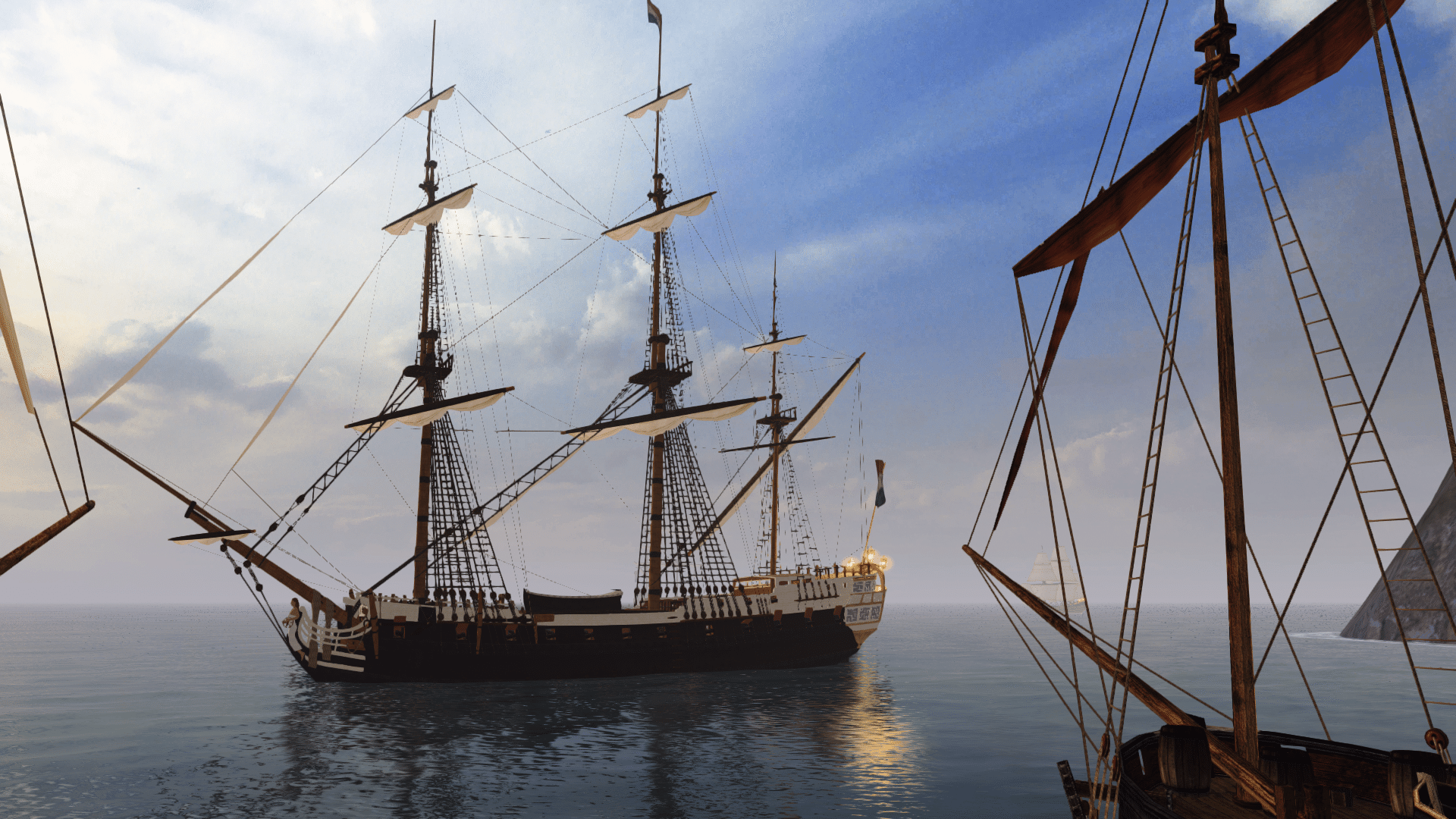
Released Frigate "Rossiya", 1728

Thank you armada.
as i said - its a bunch of ideas, a dream and based on nothing but looking at floor plans of ships.
In "the far side eof the world", it was also possibly to quickly remove the panels between cannon deck and Captains quarters... (?) which were made of very thin and light wood, i recon.
Anyway - i have to thank you, because pictures like these are what makes a man dream. Evasion from the landllubber experience i live, wondering if i could adapt to a life on sea...

Keep up this splendid work. I love walking around and"hanging about" a cabin... on Surprise, and the 28 / 30 / 32 cannon sisters too.

Compared to the default Ballrooms that are used as "cabin" in the Captain vs Captain fights, the Modders ones are the real deal.
 
well them, send hime somehere selse, and hang the Navigators hammock there XD

which brings about an interesting question:
How is the definition of "personal quarters"? Just the spot where the cap' sleeps?
or is the entire "grand cabin" also considered the captains personal area, where he can do as he pleases?
*beardscratching*:shrug
 
They served as his personal office, sleeping quarters, and dining room. He would only invite officers in if he chose to. Their quarters were down in the orlop deck, which was under the gun deck.
 
Here's another update, with a few key changes.
Firstly, of all the things I could nearly have forgotten, I can't believe the belfry was one of them. :rolleyes: So I built it from scratch, instead of using a pre-built one, to get the best result:

Frigate1_new37.jpg


One other detail that was almost forgotten is a capstan. I'm assuming it would be positioned somewhere between the main and mizzen masts, but on which deck?
I'm wondering because this isn't shown on the wooden model, so it's possible it was situated on the gun deck.

I've also modified the bow chaser ports as per SeaNorris' advice. Or rather, turned what were probably access ports into chaser ports. :wp
You can see the modified colouring for the mast bases in this image, as well.

Frigate1_new38.jpg


Now onto the cabin, which I've given a change of furniture, because I decided I didn't like some of the old stuff.
I've added various objects to the desk and moved things around, and I reckon the layout looks much better this time.

Frigate1_new39.jpg


Frigate1_new40.jpg


I had a look at the possibilities for blocking off the quarter galleries for their alternative uses, and it seems wooden partitions would each meet the stern gallery half-way between one of the outermost windows. My question is, would this have been normal? And if not, would a curtain be a good enough replacement?
 
A curtain would certainly work well enough. Better, actually, since it can fold up and is very light. I've never had any problems with them moving with the swell.
Surprise's quarter galleries were curtained off in M&C, but I haven't looked into that particular detail.
 
That's great, Armada! I definitely like what you did with the desk as well.
There is enough on there to make it look like it is being used, without being over-the-top or adding too many polygons as far as I can see. :woot
 
There is enough on there to make it look like it is being used, without being over-the-top or adding too many polygons as far as I can see. :woot
Yep; the total poly count in the cabin, excluding the cannons, comes to just over 3,000. Doesn't put much of a dent into the overall count, and it looks good as well. :D
 
Would putting upholstery that matches the chair cushions on top of that bench below the gallery be possible?
That would look really, really good.
 
Those chairs are a huge improvement by themselves. That type od chairs are very durable and pretty comfortable. Plus they look good.
 
Durable Mobiliar, not overly luxurious, made to endure sea Voyages.
The table does not block off too much space, and the disposition of the chairs is welcoming, inviting.
a folded away hammock and curtain...
...perfection.

If i were a cap' though, i would insist on a different candle holder. one that is slightly less high, and has a MUCH larger base.
the one in use right now is gonna fall over. it will.

Also love the bow section with its detailed and seemingly very complete depictions of the entire Ropes n stuff.

if i absolutely HAD to find something to bitch about?
The boats on deck could use a coat of paint to sharpen the yellow bord outline...

This Frigate will be a big DROOOOL factor.
Accurate ships like that, with detailed decks is what always insopired me to fight from the ship itself, rather than fight from the birds eye View.

Large grin here.
 
I noticed that the gammoning rope is missing. I'm assuming you haven't gotten to it yet, but it doesn't hurt to make sure.

I agree that the boats could use a new texture. I can provide you with the customary method for painting Napoleonic longboats. It would fit in fairly well earlier on, too. Actually, those models could even use replacing. Didn't the Centurion model have a special-made longboat or something?
 
Would putting upholstery that matches the chair cushions on top of that bench below the gallery be possible?
That would look really, really good.
Now that sounds like a good idea! I'll see what I can do.

Those chairs are a huge improvement by themselves. That type od chairs are very durable and pretty comfortable. Plus they look good.
Surprisingly, they also use the least amount of polygons out of all the chairs I looked at from various cabin locations.
There was even a much simpler chair, which looked far less comfortable, but had nearly twice the poly count. :shock

If i were a cap' though, i would insist on a different candle holder. one that is slightly less high, and has a MUCH larger base.
the one in use right now is gonna fall over. it will.
LOL, very true. I'll see about fixing that.

I noticed that the gammoning rope is missing. I'm assuming you haven't gotten to it yet, but it doesn't hurt to make sure.

I agree that the boats could use a new texture. I can provide you with the customary method for painting Napoleonic longboats. It would fit in fairly well earlier on, too. Actually, those models could even use replacing. Didn't the Centurion model have a special-made longboat or something?
I was planning on sorting all the remaining mast-specific details once the hull is finished, so pretty much after the cabin is done and I've added a capstan somewhere.

As for the boats, I've been tempted to replace them for some time now. They really do look quite bad compared to the rest of the ship, and that's even after giving them a higher-resolution texture a few months ago. The Centurion does have a much better boat model, as do most of the ships designed for PotBS. I suppose, if Kris doesn't mind, I could use that one as a replacement. :wp
 
Quick update: I've added curtains, upholstery, and fixed the candle base.
I chose to make the curtains match the chairs, but if anyone has a better idea for the colour, let me know.

Frigate1_new41.jpg


I'm also wondering whether to extend the hanging knees downwards to hide the jagged edges where the galleries meet the inner wall. I'm not sure it looks right as is.
 
How would something dark red look for that upholstery? And how about something more fancy for the curtain? At the moment, it looks like sail cloth.
 
I don't know. The whole point was for the upholstery to match the chair cushions. :p
The curtain could certainly be improved, but I'm mainly wondering about the colour. I tried a dark red originally, but wasn't sure if it complemented the existing colours.
 
Could you show the dark red for upholstery and curtain? I'd like to see how it looks, at least.
The cabin looks very classy, but I could imagine some captains might want to add a bit more... colour?

How would those chairs look if they're also dark red, for example?
 
duuude!
me want!

does a fat ass captain like that russian dude in red clothes have enough space to sleep behind that curtain??

hanging knees: yes, try and stretch them down to the floor, to hide the edges.
new candle holder: check! safety first!
Colors are a matter of taste, and if i want my custom frigate, i better get painting myself :D
 
I don't particularly want to make the chairs red; somehow I 'd imagine that working better with brown galleries instead of white ones.
Maybe a red curtain would be fine, though. It wouldn't look so much like sailcloth, at least.

EDIT: The captain would probably sleep in a hammock above the starboard cannon, with partitions around it, though neither have been modelled as explained. I wouldn't expect him to sleep in the tiny quarter gallery! xD

Good point about customisation. Interior details like this could be an in-game customisable feature in Hearts of Oak.
 
I like the pattern on the chairs. It looks more opulent than plain red. You could make the curtain a dark emerald green. That might look good with the chairs. You could also just make it the same shade of green that is on the chairs. The hanging knee shouldn't be extended, but you could just extend the inner hull planking* so that the forward part of the gallery is separated from the cabin for about three feet. It might look good if you extended the planking like that on the other gallery, too, but omitted the curtain.

*It's called the ceiling. Not to be confused with the overhead, which is what a landman might consider the ceiling.
 
Back
Top