-
Visit our website www.piratehorizons.com to quickly find download links for the newest versions of our New Horizons mods Beyond New Horizons and Maelstrom New Horizons!-
Quick links for Beyond New Horizons
- Download latest version
- Wiki - FAQ - Report bugs here - Bug Tracker on Github -

Quick links for Maelstrom
- Download the latest version of Maelstrom
- Download the latest version of ERAS II - Download the latest version of New Horizons on Maelstrom
-

Quick links for PotC: New Horizons
- Download latest version
- Wiki - FAQ - Report bugs here
-

Thanks to YOUR votes, GOG.com now sells:
- Sea Dogs - Sea Dogs: Caribbean Tales
- Sea Dogs: City of Abandoned Ships
Vote now to add Pirates of the Caribbean to the list! -

Quick links for AoP2: Gentlemen of Fortune 2
- Downloads and info
- ModDB Profile
- Forums Archive -

A Pirate Podcast with Interviews
Music, Comedy and all things Pirate!
- Episode Guide - About - Subscribe -
- Twitter - Facebook - iTunes - Android -
- Youtube - Fill the Coffers -
You are using an out of date browser. It may not display this or other websites correctly.
You should upgrade or use an alternative browser.Screenshots thread
- Thread starter Colosseum
- Start date
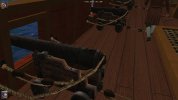
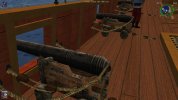
Thanks for that. I've got to admit that does fit better with the cannons on the other ships.
You guys are doing a nice job updating a ship that was already nicely done to begin with! I have become intrigued by the idea of having a picture of some sort applied to the stern of the polacca. I do not know how to place on on the ship but I have changed one that was already on the ship by pasting a new one over an existing one on the bortout of the light pinnace. Where to locate it so it looks good on the polacca texture is a problem as it does not use a bortout.
Does anyone have any ideas?You'd need to find out what texture IS used for her stern.I know that one. It is one I copied and renamed to wood_po. I also found some picture textures for the Pinnace Berlin from GOF2 called wappen. So I converted them to .tga and tried to merge them but got an error when I tried to convert the result back to .tga.tx.
So I'm kinda stuck for now.A quick look in the GM-viewer shows that you have the empty frame in part52. But nothing more there.
On the Polacca.gm itself the stern is just covered with the same planks as the rest of the ship.
I don't think we can do anything from that situation.
It was different with the GoldenHind for ex. There was a specific place on the texture file for the stern picture.
Which could be "painted over".If this is a s far as I can go it might as well get put in the game. What should it be called? Polacca new?If she looks like a particular nation's paint scheme, she could be, for example "SP_Polacca".
Otherwise, just make her "Polacca2". I like to keep the original and your one(s) too. More than one? Ok, how many do we want and which ones? The hull color is pretty much set in stone so only the trim can be changed.
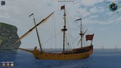
Then perhaps just the original "weathered" one that is currently in the mod, plus whichever of your variations you like best?More than one? Ok, how many do we want and which ones? The hull color is pretty much set in stone so only the trim can be changed.While working on getting this ship in the game I noticed that only 3 nations are set to use her. France, Spain, and Portugal. Since there will be two in the game soon I thought about adding one more. So here are the 4 candidates for the last slot. The textures are all from the Victory variants as those are all that comes close to working on this hull. The trim needs to be darkened and I am looking into that now.


 Last edited:How about making the last one more different by using another color?
Do all the colours go together? I like the blue stern on that second one, but the yellow hull doesn't go well with the wood of the bowsprit.While working on getting this ship in the game I noticed that only 3 nations are set to use her. France, Spain, and Portugal. Since there will be two in the game soon I thought about adding one more. So here are the 4 candidates for the last slot. The textures are all from the Victory variants as those are all that comes close to working on this hull. The trim needs to be darkened and I am looking into that now.
If it isn't possible to change the hull colour independently of that stern colour, perhaps the wood can be replaced with a darker variant for increased contrast?Another color? Where?
That isn't blue, but black.
You guys don't like the white so those two can be dropped.Are you telling me that section circled in red here is BLACK???
And my suggestion would be to change the bowsprit there (marked with blue) to a darker wood so that it has more contrast with the hull (marked with green).I stand corrected. It looked black to me but it is indeed dark blue.
Here are some close ups of those two ships. Now I am thinking about changing the texture around the rear windows. The hull is divided into a lower half and an upper half. The lower half and the stern where the picture frame is, is one half and the rest is the upper half. Everything else is in another GM.
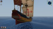

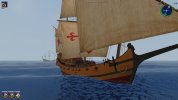
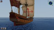
Hylie does not do texturing. He just HEX edits different existing textures onto the GMs.I'd say it looks a bit to "clean" now. Maybe make the texture with a bit more noise?I'd say it looks a bit to "clean" now. Maybe make the texture with a bit more noise?
It is hard to find textures that come close to fitting that hull. Either the planks are huge and look out of place or they are too small and look too fine. These hull textures are from the Victory class 1st rates.
When I try to edit textures the TXConvertor says they have errors and will not convert them.


