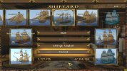
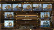
Oh. Regarding the new interface buttons, there does not seem to be enough contrast so it is sometimes hard for me to see which buttons are highlighted. This is most noticeable in the shipyard when I need to repair ships and can not quite see which ones need repair.
-
Visit our website www.piratehorizons.com to quickly find download links for the newest versions of our New Horizons mods Beyond New Horizons and Maelstrom New Horizons!-
Quick links for Beyond New Horizons
- Download latest version
- Wiki - FAQ - Report bugs here - Bug Tracker on Github -

Quick links for Maelstrom
- Download the latest version of Maelstrom
- Download the latest version of ERAS II - Download the latest version of New Horizons on Maelstrom
-
Quick links for PotC: New Horizons
- Download latest version
- Wiki - FAQ - Report bugs here
-

Thanks to YOUR votes, GOG.com now sells:
- Sea Dogs - Sea Dogs: Caribbean Tales
- Sea Dogs: City of Abandoned Ships
Vote now to add Pirates of the Caribbean to the list! -
Quick links for AoP2: Gentlemen of Fortune 2
- Downloads and info
- ModDB Profile
- Forums Archive -

A Pirate Podcast with Interviews
Music, Comedy and all things Pirate!
- Episode Guide - About - Subscribe -
- Twitter - Facebook - iTunes - Android -
- Youtube - Fill the Coffers -
You are using an out of date browser. It may not display this or other websites correctly.
You should upgrade or use an alternative browser.Solved Interface Texture Changes
- Thread starter Armada
- Start date
Armada is now ALSO our resident Interface Expert!
Are you on about buttons that are not active, with greyed out text? I don't think the buttons themselves actually change colour; it's only the text that becomes grey instead of white.Oh. Regarding the new interface buttons, there does not seem to be enough contrast so it is sometimes hard for me to see which buttons are highlighted. This is most noticeable in the shipyard when I need to repair ships and can not quite see which ones need repair.
Would it help if I made the buttons darker, do you think?
I just change textures and numbers and see what happens...Armada is now ALSO our resident Interface Expert!

Isn't that what ALL Experts do?I just change textures and numbers and see what happens...
 Drat! I was going to get screenies and forgot.
 There is not enough difference between greyed out and not greyed out. I choose repair based on looking at the ship's stats and seeing that it needs repairs.Try this darker version of the file, and see if it helps: Icons_new_dark.7zSo we should use the dark version?
Probably. I actually think it fits in with the brown backgrounds slightly better than the lighter one.So we should use the dark version?
With that texture, I also changed the 'scrollbars' (boxes with arrows either side) you see in the Select Storyline screen, to have a wooden background texture and gold borders.
Compare this screenshot to the other one in the first post:
EDIT: I meant to add that you need the attached version of NEW_INTERFACES\select_storyline.ini for the modified character, ship and profile name boxes to display correctly.
Attachments
Where do they go? Your working POTC--->resource--->ini--->new interfaces.Oh yeah, RESOURCE\INI\NEW_INTERFACES.
I think I've found one more incorrect use of the scrollbar, in the goods transfer interface between friendly/captured ships.
This file should fix it, but I haven't been able to test it yet. Same folder as before.Attachments
Thanks a lot!
And these go into the regular INTERFACES folder, right?I also noticed that the blue version of the scrollbar was being used incorrectly with the item trade (buy/sell quantity) and discard menus.
The attached files fix that issue.
Could you upload the original INTERFACES\select_storyline.ini please? I accidentally put the modified INTERFACES_NEW version in that folder. Sure looks like it. Cheers, mate!
Nope, they go in NEW_INTERFACES. They're fixes for the brown interface, where the blue scrollbar was showing up instead of the brown one.Thanks a lot!
And these go into the regular INTERFACES folder, right?
Speaking of fixes, one thing that was annoying me was the text displayed in the Relations screen, where long character names (like Nathaniel) would cause some words to overlap.
I've managed to adjust the code so that certain lines ("Nathaniel - current colours" and "Nathaniel is known as") are anchored to the right, rather than the left, so they won't overlap text on the right.
This time the affected file is NationRelation.c, and it goes in PROGRAM\INTERFACE.
One last issue I found was in the Colonies screen, where the "Manage" button is using the blue interface's skull-style texture, but so far my fixes in NEW_INTERFACES\TradeBook.ini seem to have had no effect.
Attachments
Uhm.... Maybe then once you're done with all this in a bit, you could upload your entire INTERFACES and INTERFACES_NEW folders?
I seem to making a bit of a mess of things here.


