• New Horizons on Maelstrom
    Maelstrom New Horizons


    Visit our website www.piratehorizons.com to quickly find download links for the newest versions of our New Horizons mods Beyond New Horizons and Maelstrom New Horizons!

Solved Updating the Interface Textures

Only thing that springs to mind is you mentioned you were going to make the blue dialog interface you did slightly less blue.
But other than that, I think it's all good. :bow
 
Well, I'll mark this as "Solved" for now. Of course we can always keep using this thread if more crops up in the future.
 
I recently thought about the dialog interface and found this thread.

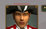
If the blue dialog interface might be a bit too much, I edited it a little. The background for the dialog text has the blue closer to the stock texture, and the backgrounds for the face picture and character name are in green, also closer to the stock texture.
bluedialoginterface.png

I'm not a graphics artist but I think it turned out well.

Place in RESOURCE\Textures\Dialog. Might want to make a backup of the current one if you want to compare them.
Attachment removed. Please see my next post.
 
Last edited:
Thanks, @Baste! :onya That was a little too late for the November update but, unless anyone objects, it's going into the next update - whenever that is...
 
I noticed that both dialog interfaces weren't quite right, like the background for the face picture sticking out of the borders and seams in the borders. I spent days trying different ways to fix it and think this is the best result. The previous attachment has been removed, so please download this instead.
 

Attachments

  • dialog interfaces.zip
    221.8 KB · Views: 77
There doesn't seem to be much difference between the new texture files and the ones from 9th November apart from the borders being brighter and the edges sharper. And the new "Dialg2.tga.tx" has a green background for the character's name instead of the brown background which fitted better with the general brown theme.

Can you post a screenshot using the older versions of the files showing the background sticking out of the borders? I see no such problem in the screenshot of 9th November, nor have I seen it while playing the game.
 
There indeed aren't many differences, but they are there nonetheless. The borders for the face picture have the most differences, and here are several pictures showing the differences.

In the old Dialg2.tga.tx the borders for the face picture are more brown, whereas the borders for the character name and dialog text are gold on the outside and black on the inside. The old dialog.tga.tx also has gold and black on all borders. I thought it to be more consistent that both interfaces have gold and black on all borders.
oldbrowngoldblack.png newconsistentgoldblack.png

Green for the character name background is actually consistent with the brown interface overall as green is used in several places for name backgrounds, such as here:
green1.png green2.png

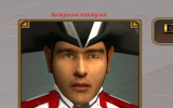
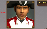
Here are closeups of the face picture background sticking out and the seams, as well as a picture of the new Dialg2.tga.tx where there is no sticking out and no seams. The corners of the borders for the face picture have to be square for the background to not stick out.
stickingout.png seams.png noseams.png

There are also some other differences but they are even smaller so shouldn't be worth showing in a picture. Just general touch up.
 
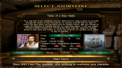
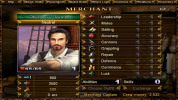
The green used on the character interface and storyline selection boxes is not the same as the blue-green you've used for the blue interface dialog box. If you want to be consistent, they would all need to be the same as the character interface green - which I for one do not want to see! So the dialog box in "Dialg2.tga.tx" should really stay brown to be consistent with the rest of the dialog interface.

The rest... since you've done the work, there's no point in wasting it. Put "Dialg2.tga.tx" back to brown and it can go into the next update, and your new "dialog.tga.tx" is going in as it is. :onya
 
The green in the name background in the new blue dialog interface is closer to the stock texture and was determined by taking the average color values from the green face picture background in the 2013 Dialg2.tga.tx. I'd say the name background in the brown dialog interface should also have it since it has that green in the face picture background and since green is used quite a bit in the brown interface overall when highlighting stuff, even though they are not the same green. :shrug

But sure, I can revert the name background in the brown dialog interface back to brown. Before I do anything, a thought occurred to me: What do you and/or others think about the face picture background in the brown dialog interface, should it be green like it is or should it also be brown?

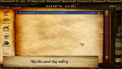
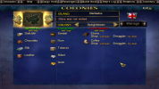
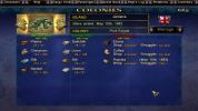
While we are on the topic: I noticed that entries are highlighted in blue on the "Quest Book" and "Ship's Log" screens and not green like elsewhere in the brown interface. Might be an error. Also things are misaligned on the "Colonies" screen in the blue interface.
brownquestbook.png brownshiplog.png bluecolonies.png
 
The green in the name background in the new blue dialog interface is closer to the stock texture and was determined by taking the average color values from the green face picture background in the 2013 Dialg2.tga.tx. I'd say the name background in the brown dialog interface should also have it since it has that green in the face picture background and since green is used quite a bit in the brown interface overall when highlighting stuff, even though they are not the same green. :shrug
Being a user of the brown interface, I'd really prefer the name background to stay as it is now. The blue-green background for the blue interface setting is indeed closer to stock texture.

But sure, I can revert the name background in the brown dialog interface back to brown. Before I do anything, a thought occurred to me: What do you and/or others think about the face picture background in the brown dialog interface, should it be green like it is or should it also be brown?
Perhaps that's something to consider for 2023? I'm about ready to release the new update; literally all that's stopping me is the chance that there might be a forthcoming brown dialog interface texture with the improved edges but still with the brown background. If you can make and upload that, I can have the update ready almost immediately after I see it.

While we are on the topic: I noticed that entries are highlighted in blue on the "Quest Book" and "Ship's Log" screens and not green like elsewhere in the brown interface. Might be an error. Also things are misaligned on the "Colonies" screen in the blue interface.
View attachment 41476 View attachment 41477 View attachment 41478
Before altering those, see what happens if there are more entries in the quest book or ship's log. Is the blue line simply to highlight the most recent entry? Or the one to which you've scrolled? And see what happens to the "Colonies" screen when values have been filled in by trading at the shop or doing a deal with a smuggler, otherwise you could end up fixing it when no prices are shown but breaking it when prices are filled in...
 
Fair enough. I myself tend to use the blue interface. I'll have the brown dialog interface texture ready later this week, likely today or tomorrow. :onya

Before altering those, see what happens if there are more entries in the quest book or ship's log. Is the blue line simply to highlight the most recent entry? Or the one to which you've scrolled? And see what happens to the "Colonies" screen when values have been filled in by trading at the shop or doing a deal with a smuggler, otherwise you could end up fixing it when no prices are shown but breaking it when prices are filled in...
The entry that is scrolled to is highlighted in blue regardless of how many entries there are. I'm thinking it should probably be in green, like it is for example when scrolling through the skills and abilities.
I checked after trading at the store and the prices were filled in but the placement was the same. Could you check how it is after dealing with a smuggler? I've never done that so I don't know how to check it.
 
Fair enough. I myself tend to use the blue interface. I'll have the brown dialog interface texture ready later this week, likely today or tomorrow. :onya
Assuming that, with the brown dialog background restored, the only difference in "Dialg2.tga.tx" is the improved frame for the talking head, I've done a quick bit of Photoshop work myself so that I can get the update out today. If you upload a different version, I can re-upload the update to use it, but at least uploading the update now gives players another day to try it out and report problems before I disappear for the Christmas holiday.

The entry that is scrolled to is highlighted in blue regardless of how many entries there are. I'm thinking it should probably be in green, like it is for example when scrolling through the skills and abilities.
I checked after trading at the store and the prices were filled in but the placement was the same. Could you check how it is after dealing with a smuggler? I've never done that so I don't know how to check it.
I'd be inclined to leave the ship log and questbook alone, then. If the stock game uses a different colour to highlight the currently selected entry then perhaps use that for the blue interface, otherwise it's a different highlight for a different part of the game and owes nothing to background colours for other parts.

The quickest way to do a smuggling job is probably to start a FreePlay game as a smuggler. ;) Or start as a privateer, then talk to the local governor and take the job to investigate smuggling. (British privateers start at Speightstown where there is no local governor, so pick another nation.) Either way, do some trading at the local store too, so you get some prices showing up for non-contraband goods.
 
I just finished my work on the texture, saw your update, checked your file, and it's the same as mine. My Dialg2.tga.tx but with the brown from the 2013 Dialg2.tga.tx added back.

I'd be inclined to leave the ship log and questbook alone, then. If the stock game uses a different colour to highlight the currently selected entry then perhaps use that for the blue interface, otherwise it's a different highlight for a different part of the game and owes nothing to background colours for other parts.
The stock game only has what in the Build Mod is called the blue interface, and in the Build Mod the blue interface has the entries highlighted in blue as could be expected. It is that the brown interface also has the entries highlighted in blue, when green could be expected for that interface. I couldn't find where that is handled, however.

The quickest way to do a smuggling job is probably to start a FreePlay game as a smuggler. ;) Or start as a privateer, then talk to the local governor and take the job to investigate smuggling. (British privateers start at Speightstown where there is no local governor, so pick another nation.) Either way, do some trading at the local store too, so you get some prices showing up for non-contraband goods.
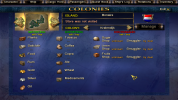
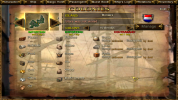
Even with prices filled in it still seems things will be misaligned, with text going over borders and lines and such.
bluesmuggling.png
 
Thanks, Pieter. :)

I tried to do something about the Colonies screen. How about this?
bluecoloniesedit.png browncoloniesedit.png
I didn't change anything in the lists, just removed the lines, extended the background, and also centered the contraband text for both the blue and brown interfaces.

If you like these I'll upload them along with some other fixes I'm currently working on.
 
I tested the new not so blue interface for dialogs but I prefer the bluer one. Think it matches the other interfaces in the blue alternative better.
green.jpgblue.jpg
 
I could add my fixes to that as well for those who prefer it, but I guess we have to decide which one is going to be enabled by default. I think the 2013 version is a too intense blue, so I made the new closer to stock version.

Here are several interface fixes. Mainly extensions of the backgrounds in the blue interface so that things fit inside the borders, but also centering of a bunch of stuff and other small adjustments. I couldn't find how to change the position of some things so those are still on borders but overall things generally fit better. When something also affected the brown interface I adjusted that interface accordingly. There might still be interfaces that could be improved but at least this should be better than before.

I should mention that these files are based on the November update, in case something might have been added to them in the December update.

The C files go in PROGRAM\INTERFACE.
The blue files go in RESOURCE\INI\INTERFACES.
The brown files go in RESOURCE\INI\NEW_INTERFACES.
The brown TradeBook.ini goes in RESOURCE\INI\NEW_INTERFACES\animation.
Attachment removed. See later posts.
 
Last edited:
green.jpg blue.jpg brown.jpg

I don't think the blue is more blue than the brown is brown.
Also, in the "green" variant the color differs in the upper and lower fields.
 
If it's going to be a vote I prefer my versions for the reasons in the posts above. I understand others can disagree, and if you want changes such as all blue or all brown - such as no green in the backgrounds for the face picture and name - or other changes then please tell me so I could make those adjustments. If the versions I prefer aren't going to be included as defaults I will simply add them myself to my install, and I suggest everyone to do that if the version you prefer isn't a default.

Also, in the "green" variant the color differs in the upper and lower fields.
Could you please explain what you mean?
 
Back
Top