i'd imagine the sides should look more like real life sides. i can't go look for an exemplary image right now though.
-
Visit our website www.piratehorizons.com to quickly find download links for the newest versions of our New Horizons mods Beyond New Horizons and Maelstrom New Horizons!-

Quick links for Beyond New Horizons
- Download latest version
- Wiki - FAQ - Report bugs here - Bug Tracker on Github -

Quick links for Maelstrom
- Download the latest version of Maelstrom
- Download the latest version of ERAS II - Download the latest version of New Horizons on Maelstrom
-

Quick links for PotC: New Horizons
- Download latest version
- Wiki - FAQ - Report bugs here
-

Thanks to YOUR votes, GOG.com now sells:
- Sea Dogs - Sea Dogs: Caribbean Tales
- Sea Dogs: City of Abandoned Ships
Vote now to add Pirates of the Caribbean to the list! -

Quick links for AoP2: Gentlemen of Fortune 2
- Downloads and info
- ModDB Profile
- Forums Archive -

A Pirate Podcast with Interviews
Music, Comedy and all things Pirate!
- Episode Guide - About - Subscribe -
- Twitter - Facebook - iTunes - Android -
- Youtube - Fill the Coffers -
You are using an out of date browser. It may not display this or other websites correctly.
You should upgrade or use an alternative browser.Ship Texture Upgrading Project
- Thread starter Armada
- Start date
heres some examples of sides on real ships
http://www.flickr.com/photos/64339105@N08/5860247339/in/set-72157626898257045
http://www.flickr.com/photos/64339105@N08/5860798966/in/set-72157626898257045/
drawing with a bunch of different types : http://www.flickr.com/photos/64339105@N08/5860247537/in/set-72157626898257045/
for the gunports, I would suggest either
a) adding a rail on top of the side to make full gunports
b) rounding the bottoms of the gunports
c) bringing the sides up to make full gunportsUnfortunately, those images just confirm what the problem is; the sides vary immensely from ship to ship.
The only other problem is that most of the stock ships also use the side texture for the stairs, so I need to make something which satisfies both.
Perhaps I could just use similar planking to the deck, but less dirt-covered and uneven? Well, I'll try something and show you the results.Here's what I've done to LuggerVML's deck, which used to look very different to most ships:
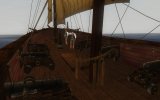
All I really changed here was the deck planking and the colour of the cannons, to match up better with ships using 'deck.tga'.
On that note, any thoughts on this ship's side panel texture? I reckon it looks better than the current deck.tga version, so do you think it would look good as a replacement? OK... while I was hoping for some kind of comments on the ideas in my last post, I went ahead and experimented with the sides anyway.
Here's what I've come up with, again demonstrating with the Light Frigate. Note how the texture also fits the stairs pretty well:
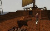
Also, I've started applying this kind of deck planking to the decks you see when boarding or walking around in 3rd person, with some good results:
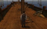
And in other news, while I was looking at the textures for the boarding decks, I found a much better version of the lifeboat texture.
This is the small boat you see moored at port, with crew sat in it, but it also appears on most of the newer ships models.
Here's a preview, showing the old one on the left, and the new one on the right:
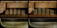
It's amazing what we've got lurking around in other textures, that we've never even noticed before!
So any thoughts on the above? Don't be scared, I won't bite you for commenting... honest! Oooh; I do like that! Should help a lot in uniformity too.
 Personally I like the way the Heavy Lugger looks now. The other stuff is a definite improvement tho.the hatches look very strange now. their quality is too low compared to the deck, so they look like they're completely loose.
You mean the hatches that lead to the lower decks? I see your point, they do look out of place.the hatches look very strange now. their quality is too low compared to the deck, so they look like they're completely loose.
I think 'desk.tga' has more a detailed version, so I'll see if that makes a difference.
@Pieter, uniformity was definitely what I had in mind.
It would be nice to reduce the differences between the boarding decks and normal decks, so you don't look like you're on a completely different ship when boarding.
I'm especially keen to use some of the higher quality textures, such as the lifeboat one, to liven up the normal decks a bit. wait, so there's no more glass in them now?
Thagarr
Pining for the Fjords!
Creative SupportStorm ModderPublic RelationsHearts of Oak DonatorPirate LegendIt looks like the glass is much cleaner, more transparent. I think it's more historically accurate for clear glass it to be a bit opaque and cloudy though. It appears like the original texture was going for the stained glass look. It looks like the glass is much cleaner, more transparent. I think it's more historically accurate for clear glass it to be a bit opaque and cloudy though. It appears like the original texture was going for the stained glass look.
I don't think so. To me it looks like the upper half is the stock plain texture and underneath they have used alpha transparency to cut the glass part of that texture away.the flame now also floats in nothingness now, which the unclear glass held hidden. i'm not so sure about this one.Thagarr
Pining for the Fjords!
Creative SupportStorm ModderPublic RelationsHearts of Oak DonatorPirate LegendI don't think so. To me it looks like the upper half is the stock plain texture and underneath they have used alpha transparency to cut the glass part of that texture away.
Thanks mate, I always forget about alpha channels! I don't think so. To me it looks like the upper half is the stock plain texture and underneath they have used alpha transparency to cut the glass part of that texture away.
Thanks mate, I always forget about alpha channels!
No prob, its a whole lot to keep track off.. or so :
:
An modeled candle would be perfect to put inside. And an little bit tuneddown alphacannel so at 90% to see a fraction off the glass maybe.
@ Armada: How does the bump mapping work in AoP espacialy CoaS?
Did you made an greyscale of the texture. How do you inform the engine about the Bumpmap?
I don't know anything about whether AoP supports real bump mapping or not. I don't mod for that game yet.@ Armada: How does the bump mapping work in AoP espacialy CoaS?
Did you made an greyscale of the texture. How do you inform the engine about the Bumpmap?
All I did with the modified PotC textures is apply a bump map filter to the texture itself, so although it's not rendered by the game engine, the texture looks vaguely 3D.
It's not perfect, and of course the effect doesn't look as good from different angles, but it's better than nothing.
The same thing can easily be done to any AoP textures, using most photo editing packages like Photoshop or GIMP.I don't think the game engine understands bump maps quite well.
Definitely not to the extent some games have.


