• New Horizons on Maelstrom
    Maelstrom New Horizons


    Visit our website www.piratehorizons.com to quickly find download links for the newest versions of our New Horizons mods Beyond New Horizons and Maelstrom New Horizons!

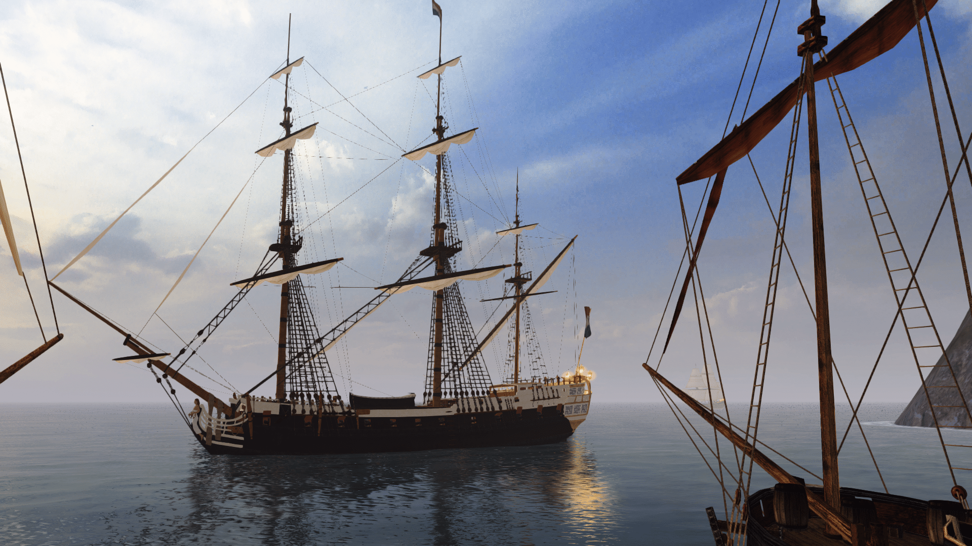
Released Neptunus Privateer

Too many ships look dull and bland. My intention is to create contrast. Dark paint gets light wood and bright paint gets dark wood.

I am limited in that I am not creating new textures. I am simply renaming existing textures. It would be nice if the modelers all used the same naming conventions for textures.

Spain eh? I am currently playing with blue as in French. We can actually have as many of these as we want.
 
I am limited in that I am not creating new textures. I am simply renaming existing textures. It would be nice if the modelers all used the same naming conventions for textures.
That would be ideal, yes. I'll always try to convince new modellers to use existing textures as much as possible, because we don't need a whole new set of textures for every new ship.

Is this French or should it be black and red?

Spanish is red and yellow?
For the French colours, if you changed the black wood to yellow/gold, it would look prefect; very similar to the Boussole paint scheme. :onya
For Spain, maybe just use the French scheme but change the blue to red?

Oh, and those bright white ropes towards the bow are annoying me. Do they have reverse lighting?
 
Those changes sound easy, especially since I just renamed a yellow texture for use on the Spanish version.

Those ropes are white and were added by Rider88. I'm going to try the Raa2.tga and see how that works out.
 
That Dutch version definitely is better than the current "Dutch" version that clearly isn't! :onya
 
This is my idea of a French version using Le Boussole as a very rough template. The Spanish version will have a red top unless someone has a better idea.
 
Uhm... I didn't mean to suggest that La Boussole was a perfect example of the French Royalty paint scheme, so I think I preferred your original version. :urgh
Specifically, I don't like the black underside of the hull (not sure why that's used for La Boussole); white would look much better.
I would suggest starting from the PO_Neptunus colours, but swap the yellow-ish hull for a natural wood finish, and swap the red gunports/stripe for yellow/gold.
Then, for a Spanish version, just swap the blue stripes for red ones. Does that sound good?
 
If I understand you right this is what you want. :shrug I used the black bottom because I thought it was more historically correct, as in tar.

The Portagee flag has green and white in it, so I'll try to make those colors look not Dutch.
 
Very close. :onya All I'd change is the two lower stripes on the hull from blue/red to black or dark brown.

To be honest, I didn't realise a tar-covered underwater hull was historically accurate. :facepalm Either way, I still prefer a white underside, but that's just me.
 
I don't know, aren't they too yellow now? Wouldn't they be mistaken for British ships now?

About the tar, I know they were painted with something, but I forget what.
 
I don't know, aren't they too yellow now? Wouldn't they be mistaken for British ships now?
Perhaps... but she looks too 'cartoony' to me with those lower blue stripes.
Then again, the some of the colours aren't very weathered, and stand out a bit too well.
The yellow in this case should be edited to look more gold-like. I could do that eventually, but for now we only need a rough idea, right?

Maybe if brown stripes were used, rather than black, there'd be less chance to mistake the ship as a British vessel. :shrug
 
This is the Spanish version. I got a new video card and am not sure if the colors look like they used to, so will stop here.

The Dutch, French, and Spanish versions are on the FTP in my folder, in the "after beta 2" folder.
 
Well I reckon it looks more believable as a colour scheme than it did before, anyway. I'm not a huge fan of plain yellow, myself. :urgh
Besides, like I said before, I think the yellow could be improved to look more gold-like. I might see if I can handle that at some point.

EDIT: I just installed your Neptunus updates, but it seems there are a few textures missing.
Can you please double-check that you included the correctly hex-edited models and all the necessary textures?

I should also mention that the colour scheme for the Spanish Neptunus now looks similar to FR_Fleuron, by coincidence.
 
Oops! They all work in my game, so I left something out. BRB.

EDIT: I found I forgot to update the French one. :eek:ops2 It is done and the file in the FTP has been replaced. I also added some more textures to the textures folder so they should all be there now. :eek:ops2
 
Thanks, that did the trick. :onya

I've tweaked the yellow/gold texture to be based on Fleuron7.tga, and toned it down a bit:

Neptunus5_new.jpg

What do you think? I'll upload the texture to my FTP folder if you prefer it.

Speaking of screenies, here's one I made for the sake of highlighting all that excellent rigging detail:

Neptunus_rigging.jpg
Not bad for a different perspective, don't you think? :keith
 
If that's the color you like, I'm fine with it. I should probably get that texture in case I put gold trim on anything, just to be consistent. :nerbz

Yeah, I sometimes look up and think about running up there and working. This is a small ship with a lot of rigging packed into a small area.

I just put the Portagee version on the FTP. It is all wood with just a bit of white. I also tossed in some more textures just to be sure none are left out.

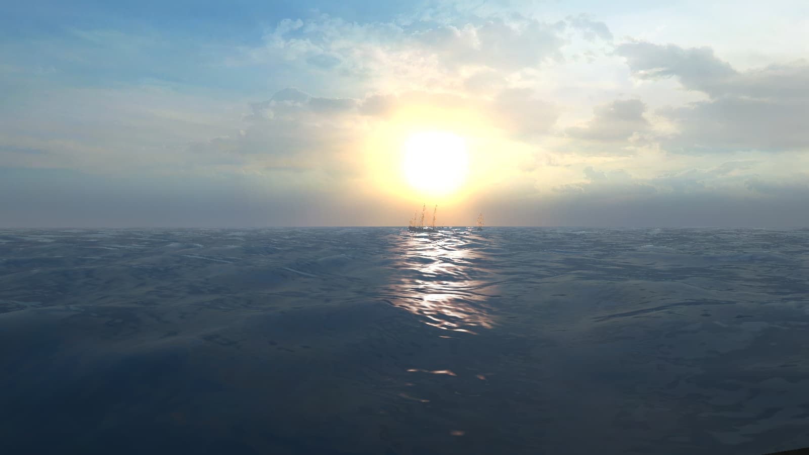
Oops. Obligatory screenie.
 
The texture is on the FTP here: http://www.pyratesahoy.com/potc/Experienced%20Captain/Wood_Grain_ylo.tga.tx


I'm liking your Portuguese texture! It's very distinctively not French or Spanish, and it's not a random mixture of colours (like some 'Portuguese' stock ships).
I reckon that's a paint scheme worth considering as an 'official' one for early Portuguese ships, once we get round to it. :hmm
 
On a ship that ylo texture looks blank. It might be better to to take my ylo and change it to that shade so it would have a wood texture.
 
Back
Top