• New Horizons on Maelstrom
    Maelstrom New Horizons


    Visit our website www.piratehorizons.com to quickly find download links for the newest versions of our New Horizons mods Beyond New Horizons and Maelstrom New Horizons!

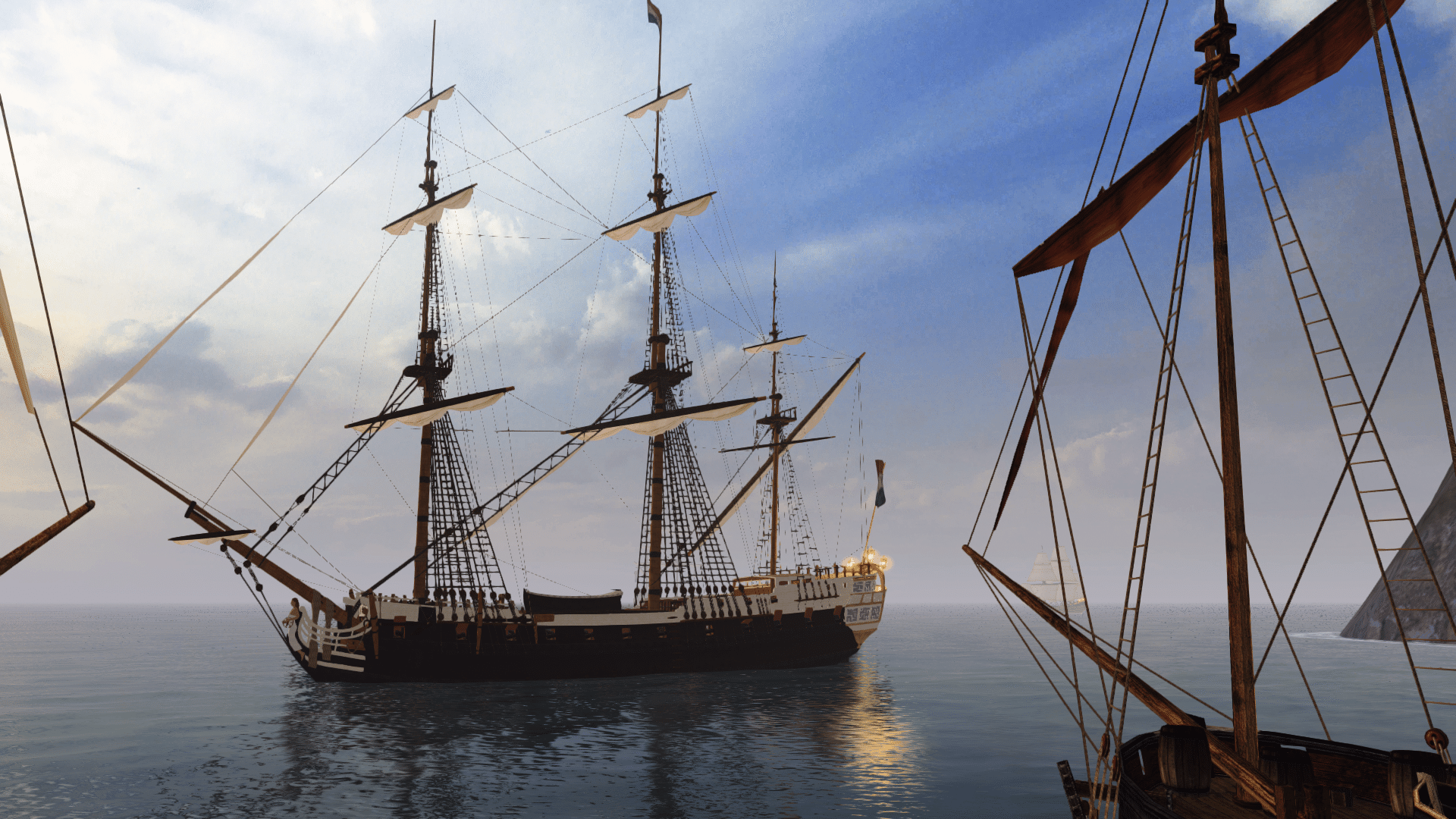
Released Frigate "Rossiya", 1728

I've just managed to make a usable sailorspoints/walk file. See attached for both versions.
Currently I've only got the crew walking around the weather deck. The Sailor Tool started stuttering after a while, making it frustrating to use, so I couldn't add points to the gun deck. I might try again tomorrow.

EDIT: Also added some new screenshots to the first post.
 

Attachments

  • Frigate_walk.c
    9.7 KB · Views: 282
  • Frigate2.ini
    2.7 KB · Views: 270
Would I be correct in saying that we can't replace the original file yet until all other frigates are replaced with the new model?
Otherwise the crew won't match with the other ones. On the other hand... that should soon be addressed, eh?

One thing I forgot to mention: Are you supposed to be able to access the quarterdeck at all?
I saw no stairs leading there, but from a gameplay perspective you might want to stand there to have a better view around you...

As for the ropes: your first image shows a feature, not a mistake. That's roughly how the real knot is meant to look.
Alrightee; just wanted to check. :doff

The second one IS being picky, though. :p
Told you so! I warned you in advance. :razz
 
Yes, the other models were based on the original Frigate1 still need to use their old walk file.
The silly thing about the stock model is that the whole thing is offset to the left slightly, so the original walk file also had to be offset. Frigate2, however, does not have this problem.
At least it will all be set right with the Rossiya, so we'll only need one walk file for all variants (except Frigate_sat, which won't be replaced).

I did say quite a while back that I wasn't planning on allowing access to the poop deck, mainly because the open cabin allows you to see aft of the ship.
I'm not sure there's enough space for a ladder, either, though I do realise the cabin doesn't make up for the height advantage of the poop deck.
Maybe I'll just make the rigging climbable, and that will more than compensate for it. ;)

By the way, I've also added some images to ModDB now.
 
I did say quite a while back that I wasn't planning on allowing access to the poop deck, mainly because the open cabin allows you to see aft of the ship.
I'm not sure there's enough space for a ladder, either, though I do realise the cabin doesn't make up for the height advantage of the poop deck.
Maybe I'll just make the rigging climbable, and that will more than compensate for it. ;)
Ah, I failed to see that back then. Fair enough in my book. :doff
 
Anyone for a laugh? How about this:
I think the images speak for themselves. :wp

Comparison4.jpg


Comparison1.jpg


Comparison2.jpg


Comparison3.jpg


And to think the old model was one of my favourites in the stock game! xD

EDIT: Oh, and here are some fun facts:
- Stock frigate total tri count: 3990
- Rossiya total tri count: 93,281 (nearly 24 times more than stock)
- Amount of stock frigate remaining in new model: 545 triangles (less than 0.006% of total)
 
Not funny...
The original has a fudged up rear deck, is low poly, has not a single bleeping wire...

The texture has these particles/artifacts/compression loss things all over it, and the rear section, where the most details are found, is simply painted on. (with said shafty texture quality)

But whats most disgusting, the masts and everything above the hull look like fricking Playmobile toys on the original.
The entire rigging, this complex, magic part that is the heart of movement, is sorely underrepresented, not cared for at all.
Nowadays i only buy ships that seem complete in that regard.

Turned out mighty fine, the Bow is just so classic, adorable,.

One is an absolutely worthy successor of the other.
The king is dead. long live the King.
 
Hey! Let's send that to Alkella! :rofl
LOL! Imagine sending them the images accompanied only by a simple ":razz". I can see the looks on their faces now. xD

Anyway, I've just about finished the French paint scheme, inspired by the frigate L'Hermione. What do you think?

FR_Frigate1.jpg


FR_Frigate2.jpg
 
The only thing I would change is making the channels (bases of the shrouds) black again.
 
Those side by side shots really show just how much hard work you have put into this model, she is absolutely gorgeous! :woot
That Frenchie paint job looks pretty good as well. :onya

Not to diminish your work at all Armada, I know you have put a lot of effort into this beautiful model, and it shows! But I do think we need to remember that 10 years ago, Akella was working under a deadline which was rushed by both Bethesda and Disney. They were also under space requirements to try and fit the game on to 2 CD's, that's 1.4 gig tops, after compression. Not to mention they were working with much earlier versions of Photoshop(5 - 6), and Gimp was only 1.2.

Those stock models were a major improvement over the Sea Dogs models, which at the time were the benchmark for sailing vessels in games.

spoiler]
 
Fantastic work mate, she is a beauty! I really like the French scheme too, though I agree with post captain that the channels should be black
 
Something I've just noticed- the overhead (the ceiling on land, the undersides of the decks) should be painted, most commonly in white.
 
I love your model! It is absolutely beautiful. I do think your texture could use some weathering and roughening up. Texture lacks some detail. I could look into it if you want, but you have to upload it in PSD, since I don't have any TXconverter on my mac.
 
The only thing I would change is making the channels (bases of the shrouds) black again.
Yeah, I need to remap them to use the main hull texture. At the moment, they share a separate texture used by the railings.

Something I've just noticed- the overhead (the ceiling on land, the undersides of the decks) should be painted, most commonly in white.
More remapping needed here.

Thagarr: I know the comparison is unfair, and I'm not trying to insult Akella in any way. It's just there for the sake of it.
Admittedly, I had never seen a Sea Dogs screenshot before, so when you put it like that, the stock PotC models were fairly good. Heck, PotC had excellent graphics for its time.
However, they must have been using Maya 5.0 to produce their models, and the 2012 version I use is pretty much the same but with a different colour UI and better performance.
So I believe Akella could very well have made at least a few small improvements to the stock ships if they really wanted to, which wouldn't take very long at all. Even just fixing the keel and bow on a few ships would have gone a long way, a bit like what I did to the Corvette.

paint looking good in color, could use a bit more wood "shinethrough"
Where does it need more wood? The stern galleries?
From what I can tell, they shouldn't have a wooden texture. See this image of l'Hermione:
20120710-092135.jpg

I love your model! It is absolutely beautiful. I do think your texture could use some weathering and roughening up. Texture lacks some detail. I could look into it if you want, but you have to upload it in PSD, since I don't have any TXconverter on my mac.
Cheers, mate. Which texture do you think lacks detail? Personally I'm quite happy with how they look, but I'll upload the PSDs if you want to try to improve them.
Bear in mind I need to have three more textures done for Pieter to include in the update this weekend, so we're talking about a strict deadline.
 
if the goal is to ghave her brand new, then go for it... what my thoughts were going for was a look after a year of service or something :)

Hermione is DA BOMB... XD

The 90-60-90 piece of hoochie-woochie among tall ships of today!:D
 
Cheers, mate. Which texture do you think lacks detail? Personally I'm quite happy with how they look, but I'll upload the PSDs if you want to try to improve them.
Bear in mind I need to have three more textures done for Pieter to include in the update this weekend, so we're talking about a strict deadline.
However, we can always include improved texture versions in a later version if the worst comes to the worst.
 
Thagarr: I know the comparison is unfair, and I'm not trying to insult Akella in any way. It's just there for the sake of it.
Admittedly, I had never seen a Sea Dogs screenshot before, so when you put it like that, the stock PotC models were fairly good. Heck, PotC had excellent graphics for its time.
However, they must have been using Maya 5.0 to produce their models, and the 2012 version I use is pretty much the same but with a different colour UI and better performance.
So I believe Akella could very well have made at least a few small improvements to the stock ships if they really wanted to, which wouldn't take very long at all. Even just fixing the keel and bow on a few ships would have gone a long way, a bit like what I did to the Corvette.

Aye mate, I understand completely, I just wanted to point out some things that people might not be aware of. They were indeed using Maya 5, and I do agree, they could have done a better job. My main point was simply that they did not have access to the same amount of time, or information, that we do. No one had ever attempted a 3D sailing game like Sea Dogs before; and the way Bethesda marketed it meant relatively few people really found out about the game until years after it's release. By that time, other games had come out with much more detailed 3D graphics, and Akella never received the kind of accolades it should have for the work that they did on both. The cultural and language barriers did not help either of course.

Anyway, my apologies for getting a bit off topic. I am really looking forward to seeing this frigate in all her glory when we finally get a working UDK framework to put her in. I think she will stand out even more as the work of art that she is!
 
I do agree with you, Thagarr. From what I can tell, Akella had the very best intentions with Sea Dogs 2. The final result is not what we would have liked to see (in large part due to Disney),
but we only got as far as we did because of the groundwork that they originally laid. Considering we're still at it 9 years later, they must have done something right!

But even Disney had a positive effect on Sea Dogs 2, because I never would have gotten the game if it hadn't been called Pirates of the Caribbean.
And who knows how the modding would have turned if I hadn't been here to take over from Nathan Kell when he didn't manage to continue anymore?
 
But even Disney had a positive effect on Sea Dogs 2, because I never would have gotten the game if it hadn't been called Pirates of the Caribbean.
And who knows how the modding would have turned if I hadn't been here to take over from Nathan Kell when he didn't manage to continue anymore?
That's the ultimate irony, isn't it? Many of us seem to dislike Disney's approach to several things, yet we're only speaking on this forum now because they hijacked Sea Dogs 2.
Funny ol' world, innit? :nerbz

Anyway, I've just released version 1.1 in the first post.
Changes include addressing most of the nitpickings, such as blocks for the rudder line and a white overhead (which actually does look much better), plus the French texture and the changes related to it (see image below). Also included the walk file for the sake of completeness.
FR_Frigate.jpg

Now working on the Dutch texture, which I want to make as faithful to the old texture as possible, while drawing inspiration from the Amsterdam.
 
Back
Top