-
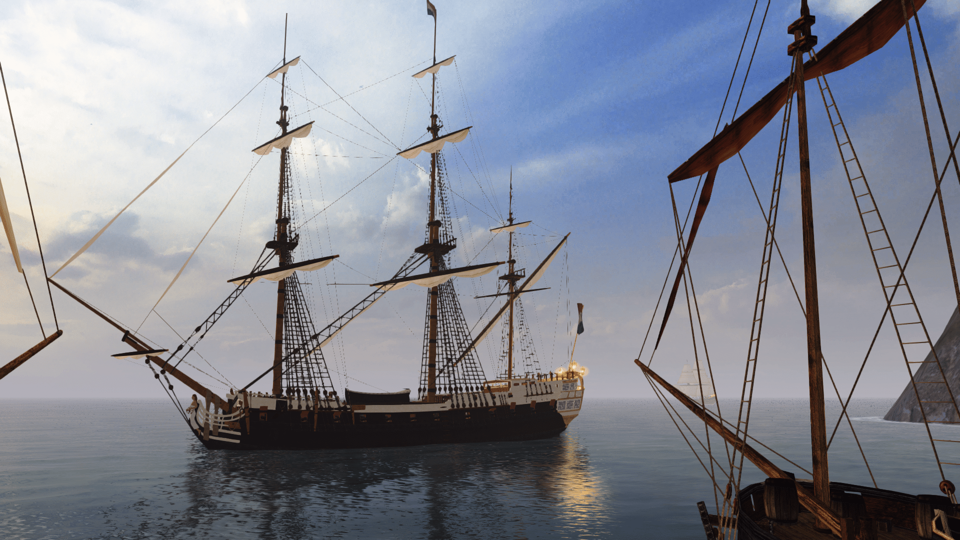
Visit our website www.piratehorizons.com to quickly find download links for the newest versions of our New Horizons mods Beyond New Horizons and Maelstrom New Horizons!-
Quick links for Beyond New Horizons
- Download latest version
- Wiki - FAQ - Report bugs here - Bug Tracker on Github -

Quick links for Maelstrom
- Download the latest version of Maelstrom
- Download the latest version of ERAS II - Download the latest version of New Horizons on Maelstrom
-

Quick links for PotC: New Horizons
- Download latest version
- Wiki - FAQ - Report bugs here
-

Thanks to YOUR votes, GOG.com now sells:
- Sea Dogs - Sea Dogs: Caribbean Tales
- Sea Dogs: City of Abandoned Ships
Vote now to add Pirates of the Caribbean to the list! -
Quick links for AoP2: Gentlemen of Fortune 2
- Downloads and info
- ModDB Profile
- Forums Archive -

A Pirate Podcast with Interviews
Music, Comedy and all things Pirate!
- Episode Guide - About - Subscribe -
- Twitter - Facebook - iTunes - Android -
- Youtube - Fill the Coffers -
You are using an out of date browser. It may not display this or other websites correctly.
You should upgrade or use an alternative browser.Need Help Some small update requests
- Thread starter Hylie Pistof
- Start date
Man those all look GREAT Hylie! The only thing I would change on all of them is the black bordering around the windows. I would change it to the same color of yellow/gold that is on the railings.
@Armada. OK Mate, that did the trick. The only thing that is still messed up is the dirty greenish grey cave looking texture around the windows. Is there anything I can do to get rid of that?
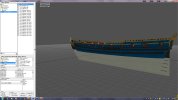
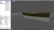
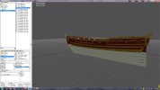
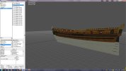
Other than that she looks great! If you like I can package her up as a COAS DL for those that want her and post the link to your Rossiya thread. Here are some screenshots. Don't yell at me for them being big. Since this is your baby I purposely thought you might like a few good images of her from COAS.
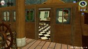
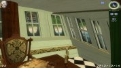
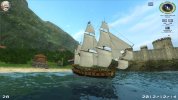
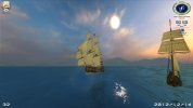
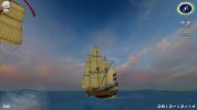 I'm not complaining about those images; the ship looks good in CoAS! It's just my hard drive complaining, but it does that a lot.
That odd-looking glass texture is the result of me trying to make something that gives the impression of glass while allowing the player to see through it. It's not perfect and probably looks too dirty, I know. I had a much nicer texture I originally wanted to use, but because it's partially transparent, the Storm Engine renders it opaque, which is useless.
There are two ways to improve it:
- Find a completely transparent texture (such as path.tga), create a copy and rename it to 'cap_deck_glass.tga'. This is what I didn't want to it to look like in the first place, though.
- I could modify the current texture to reduce the amount of 'dirt' around the edges, which might look better. It's up to you.
I'd also love to see a screenshot showing the ship with the lantern lit at night, since we are deprived of that in PotC...Attachments
Glad you like them. The trim around the windows is the same color as those strakes on the sides. That is the way she is put together, and it would take a modeler to change that. I will put the package together later when I wake up.
Oh, just for grins and chuckles I made a Christmas version too. The Neptunus is still the best tho.
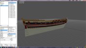
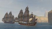 @Hylie: Very cute!!!
Do me a favor and change the strakes on the blue and brown ones to gold like the railings. I'm curious to see how she looks like that.
@Armada: Thanks for the files. I will get some shots of her at night for you.
MKDone. Let me know which ones I messed up.
https://www.dropbox.com/sh/gpalg0tpyyfcivy/0bTjwrABTO/COAS stuff/COAS repaired ships/Postillionen COAS package.7z
AARRGGHH!! They can be easily changed, but I'm a bit burned out now. These old mark 1, mod 0 eyeballs need a rest.Just downloaded them Hylie. Thank you Mate!
@Armada: Here's some screens with Rossiya - lantern lit.
Take a look at that last shot because I realized that there is an uncovered patch in the prow decoration. The three vertical decorative supports in the middle still appear to be a light model grey. Am I missing another texture?
Also that Sailorspoints file must have a bad plot or coordinate. The guys look fine, but it causes the game to lag and hiccup. Never seen this before. I substituted a couple of other sailorspoints files from several other frigates to verify this is the problem and it is.
The Sailorspoints file from the 28 gun Frigate actually works pretty good. Close match, but there are still guys going into solid wood flooring where they think hatches are. MKThanks for the screenies MK, the lantern looks quite good!
The prow decoration you mentioned is actually white, as intended. The French texture was inspired by l'Hermione, which has simliar decorations.
I'm surprsed the sailorspoints file doesn't work properly; I made that with the Sailor Tool and then created the PotC walk file from it, which works just fine. I'll have another look at it anyway.
What did you want me to do about the glass texture, by the way?The prow decoration you mentioned is actually white, as intended. The French texture was inspired by l'Hermione, which has simliar decorations.
Ah! I see. Looks fine to me anyway. Just thought I'd mention it in case.
What did you want me to do about the glass texture, by the way?
Well I don't know..... I tried like everything to figure out in Photoshop how to make part of the texture image transparent, but when I convert to TGA.TX those parts are always white. I did experiment though. Here's some screens. She's French in my game so I used the Fluer de Lis.
@Hylie: EDIT: (Disregard the following - I finally figured it out!!!) The Portuguese texture is the only one showing up on the Postillionen. None of those others want to pop out. I'm probably doing something wrong. Very confusing. I actually think the COAS way is simpler.
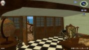
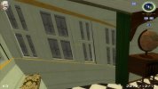
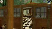
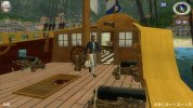
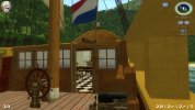 That is a nice looking ship with lots of details. Should be very immersive.
I must not have written a very good readme. Sowee.
I tried different textures on those ships and they always came out too dark or too light or too fuzzy. In fact I tried every texture in POTC. Even renaming the handrail texture so it would work there made it come out darker and fuzzy.I have to say, your Fleur-de-Lis glass texture looks very nice, even without transparency.
Attached is the texture I wanted to use on the ship, if the transparency were rendered properly in-game. In TX Converter, when you select the file and go to 'Convert', look under "Output texture format for with alpha channel images" and choose "32bit (8bit alpha, 24bit colour)", and converting with those settings should preserve the transparency. It seems to show up properly in GM Viewer, but with the small issue of 'X-ray vision' created when looking through the texture. In PotC itself, the texture renders opaque, but I'd be interested to see if it's any different in CoAS.Attachments
Thanks Armada,
I will try what you suggest when I get a little more time.
MK


