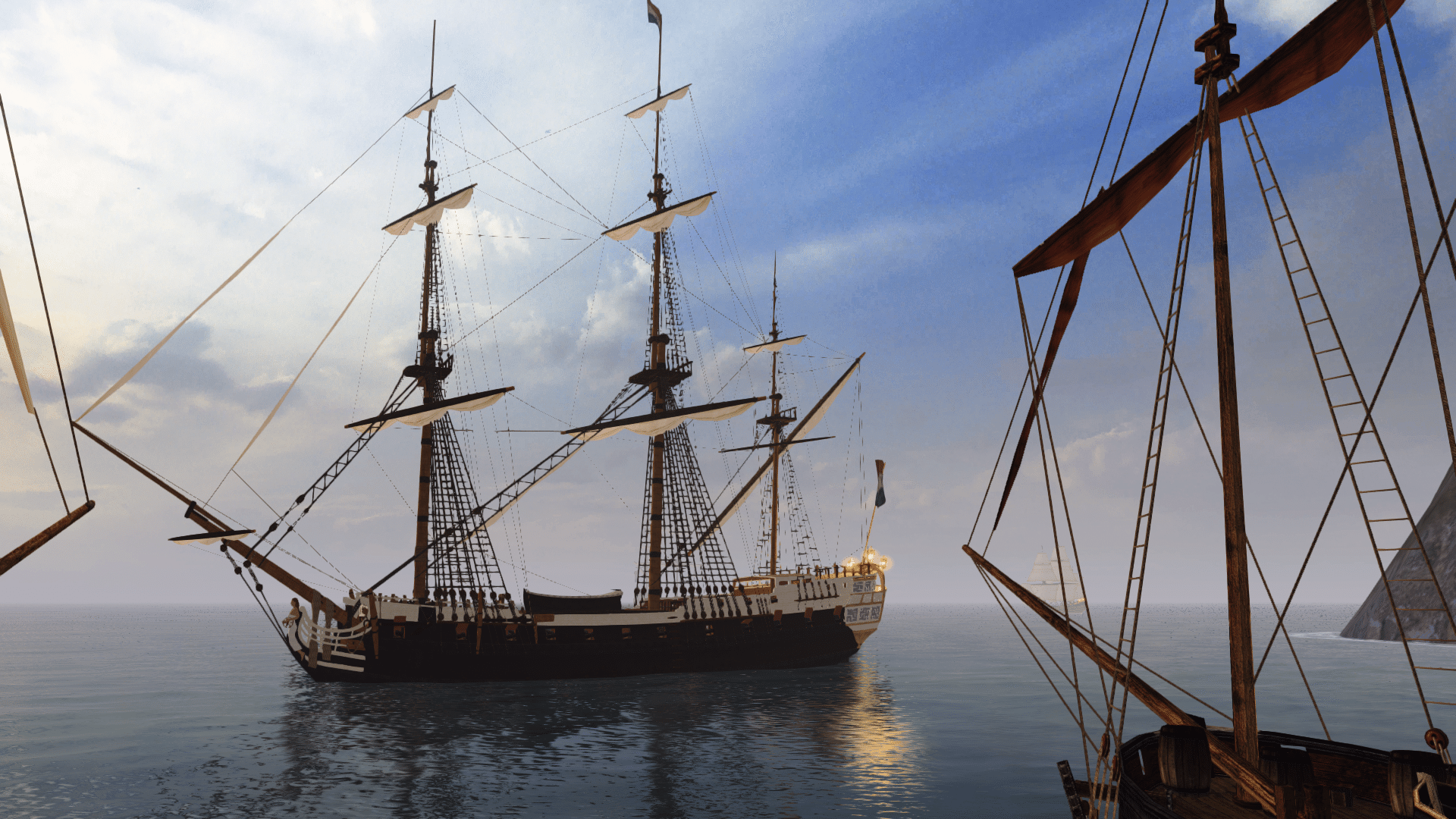
This is the successor of my other tutorial, 'Reading a ship plan' and the second of four tutorials (basic hull modelling and basic texturing are next).
I´ll take a ship I´ve already modeled as base for this tutorial, the frégate légère La Panthère (HMS Amazon in british service) of 1744.
Part 1: Research
The first thing you want to do if you found an interesting ship you want to model is to find as many background information on it as possible because it makes the actual modelling much easier.
In my case, I found a plan of La Panthère in Boudriot´s 'History of the French Frigate'. It´s not the original french plan (which sadly doesn´t exist anymore according to CATALOGUE DES PLANS DE BÂTIMENTS À VOILES CONSERVÉS DANS LES ARCHIVES DE LA MARINE, probably destroyed by the disastrous fire in the Brest dockyards in 1742), but the plan the british made when they took off their lines after her capture in 1745:

The original plan would have been better, as 'as taken off' plans sometimes contain errors. For example, the british plan for La Renommée shows more tumblehome than the original french plan, probably because the thickness of the whales wasn´t properly subtracted when the frames of the body plan were drawn.
So, we got the plan from the NMM, now we look for other sources, the best sites are https://digitaltmuseum.se, Maritiem Digitaal NL and Databasen / https://www.sa.dk/ao-soegesider/da/other/other-collection/40.
I was pretty lucky as all three of them have a copy of the british plan of 1745, so I could check each plan for distortions/inaccuracies etc.
As it turned out, the plan from the danish archives was the best:

It has a few oddities, but more on that later.
So, next stop: more research

Sister ships, date of launch designer/constructor, dimensions (very important for scaling in a modelling app), service history etc.
The best site for the first basic research on a ship is threedecks.org. It shows two entries, one for La Panthère and one for HMS Amazon. I have a danish copy without a scale of the british plan, so I checked the dimensions of Amazon to see if the numbers on the plan are correct:
length p/p 115' 6''
breadth moulded 31'
depth in hold 10' 2''
The numbers seem to be identical (I also checked the source for the dimensions, British Warships in the Age of Sail 1714 - 1792, just to be safe ), so we can move on and have a look at the other information on threedecks. The next most important info is who built the ship so we can look for possible sister ships. In La Panthère´s case, that´s Jaques-Luc Coulomb, sous-constructeur under Blaise Ollivier at Brest at the time the plans for La Panthère were made. As it turns out, he also constructed the frigate La Siréne, launched in 1744 ( the plan for La Siréne can be found in af Chapman´s Architectura Navalis Mercatoria).
Next I searched threedecks for other ships built at Brest at the time between 1740 and 1750 and which are roughly comparable in size. This brought up ten ships, the most important ones are La Renommée and L' Aramante because there two detailed monographs available about these ships which would be incredibly useful for stuff which isn´t shown on the plan like masts, interior, paint scheme, deck layout etc. And monographs also mean that there´s a high probability that there are models which can be used as further references.
This is especially crucial in my case, as I haven´t found any contemporary depictions of La Panthère/Amazon (paintings, drawings, models) which would have been a very important guideline for the modelling process.
My next research step, the (service) history of the ship, isn´t that interesting for this tutorial, so I´ll skip that.
Part 2: Preparing the plans in an image editor
Now comes the interesting (and most tedious) part. I´m using GIMP for this kind of work, but any decent image editor would do.
First, we have to determine which lines have to be 'straight' (or better, parallel to the borders of the image), so we can rotate the image accordingly if they aren´t.

The red lines (the center of the bodyplan, the center of the half breadth with the waterlines, the perpendiculars fore and aft and the station lines) should be straight on any plan. If they aren´t, you have to rotate the image (GIMP shortcut: shift + R).
Only one of the green lines ( waterline and keel) can be perpendicular to the station lines (except if there´s no difference between the draught fore and aft, but those cases are exceptionally rare)
Let´s have a closer look if the lines are straight of if we have to correct the image. First the body plan:

The blue lines are a nice visual aid (called 'guide' in GIMP) which can be accessed by left-clicking (and holding) on the pixel-scale at the top and the left of the window.
As you can see, the center line of the body plan is slightly off, so we have to correct that. To do so, we select the body plan (R), then we cut and paste the selection.
In the the layer window, we right-click the 'floating selection' and select 'to new layer'. Now we've created an new layer that can be moved/scaled/rotated independently from the rest of the image.
Pressing R will bring up the rotate window:

Looks much better after rotating:

The keel also is slightly off:

We select the sheer (the side view of the ship) and repeat the procedure we did with the body plan: select, cut, paste, rotate.
The same goes for the half breadth.
Now that the lines that should be straight actually are straight, we have to bring the body plan on the same level as the sheer (shortcut: M to move a layer)

I used the dotted line (which shows the inside of the planking) over the keel on the sheer to align the body plan with the sheer.
Edit:
Jeeeee, I almost forgot one of the most important parts: CHECK YOUR PLAN FOR DISTORTIONS!
First, we'll have a look at the sheer and half breadth.

Drop a guide an every station line, and measure the distance between them. It should be roughly same for every part between the two purple lines (expect for the two in the middle).
My measurements vary between 223 pixels and 225, which is really good considering the plan is over 250 years old. The sheer seems to be okay.
Next, the body plan:

We measure the distance between the line in the center and the lines at the sides, logically they should be the same. Green line is 678 pixels, red one too.
Excellent *insertMrBurnsgrin*
Then we compare these measurements with the length of the extreme breadth of the half breadth:

I got 677 pixel, which is very much okay

This step is very crucial if you want to model a ship from the Architectura Navalis Mercatoria from chapman.net, as these plans are compressed along the longitudinal axis, so the
red and green lines on the body plan are much shorter than the corresponding lines on the half breadth. Dividing the measurement of the half breadth by the measurement of the body plan gives you
the ratio by which you have to adjust the width of the image.
Part 3: Setting up the plans in an 3D modelling app (Blender)
So, finally, the plan is ready, let´s get it in Blender:
Set up guides to make selecting the various parts of the image easier and more exact (the select tool snaps to the borders of the guides). Corresponding colours should have the same length, the blue line should should be have as long as the red one.

The red part for the body plan is 1500x1500, sheer 6000x1500 and half breadth 6000x750.
Now it´s just a matter of selecting the various parts and pasting them as a new image. Only the half breadth requires additional steps.
This is how it should look like:

Go to the image tab and select canvas size. Double the height and move down the image in the preview picture.
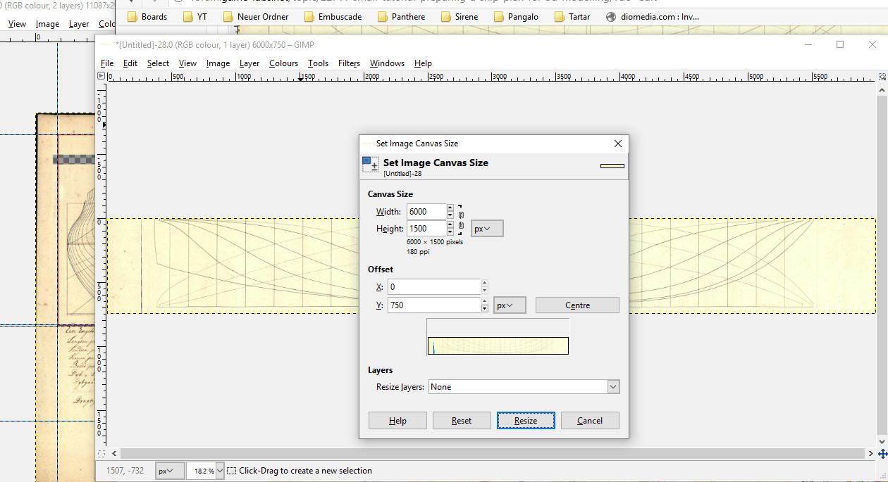
It should look like this:
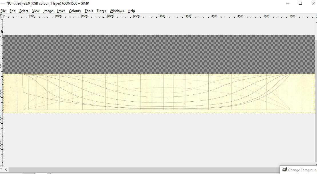
Then press ctrl+A, right click and select copy, right click again and select paste as..., then select new layer (not paste or paste into!).
This the result:
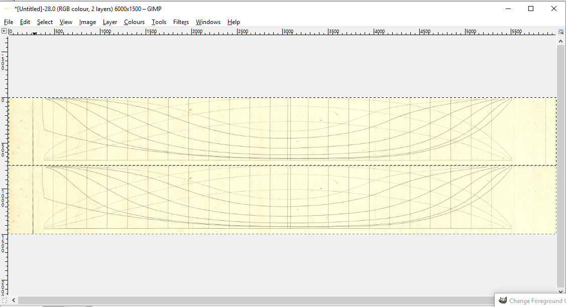
Almost there...now go to the layer tab, select transform ---> Flip vertically. Et voila:

BLENDERTIME!
Open up a new scene and select the cube, go to edit mode and select length in the mesh display/ length info.
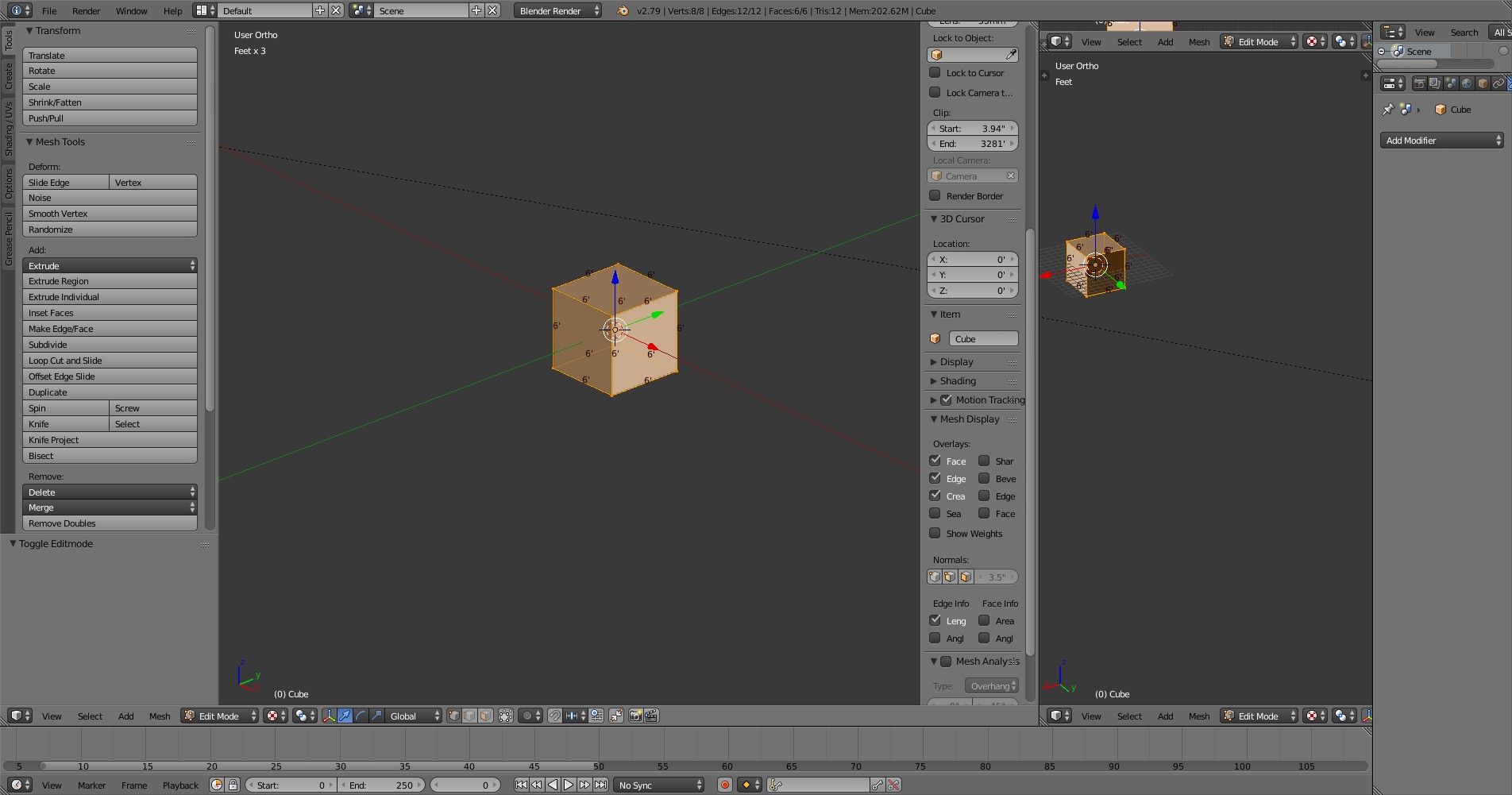
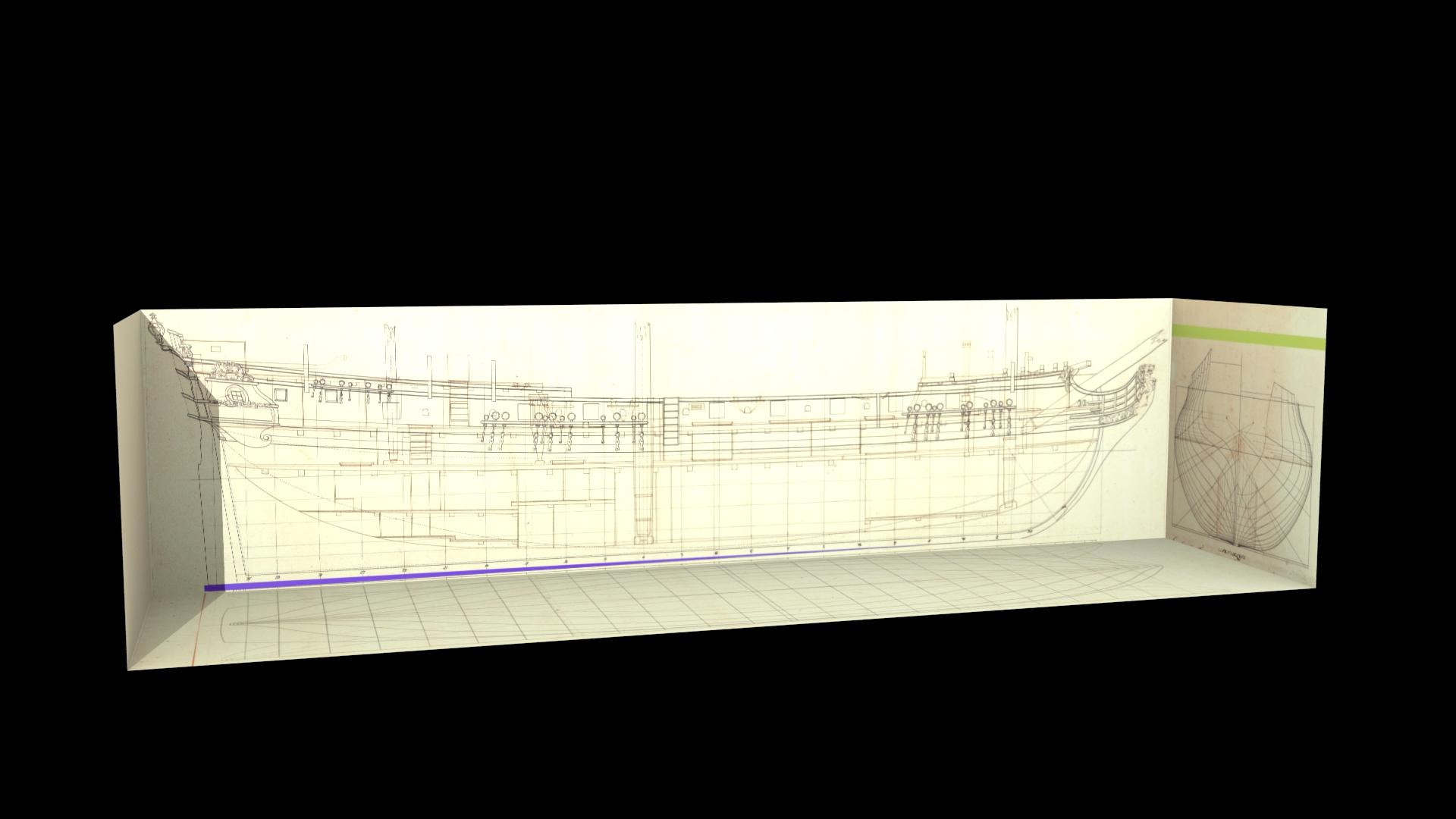
We have a length/width picture ratio of 4:1 (6000x1500 pixels), so we have to adjust the length of the cube to 24'. Then we delete the top and the right side of the cube and invert the faces:
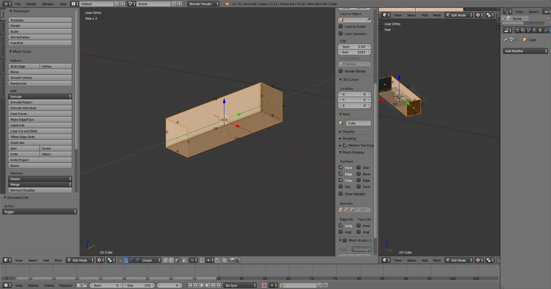
Then we assign a material to each remaining side of the object.
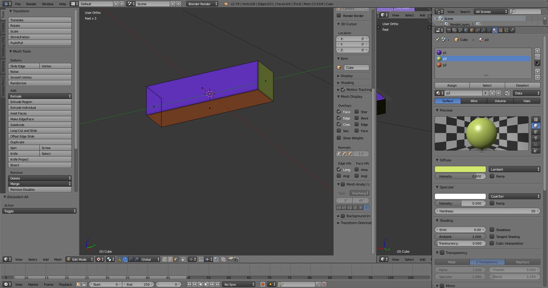
Select one face and press the corresponding view shortcut on the numpad to have a direct view on it:
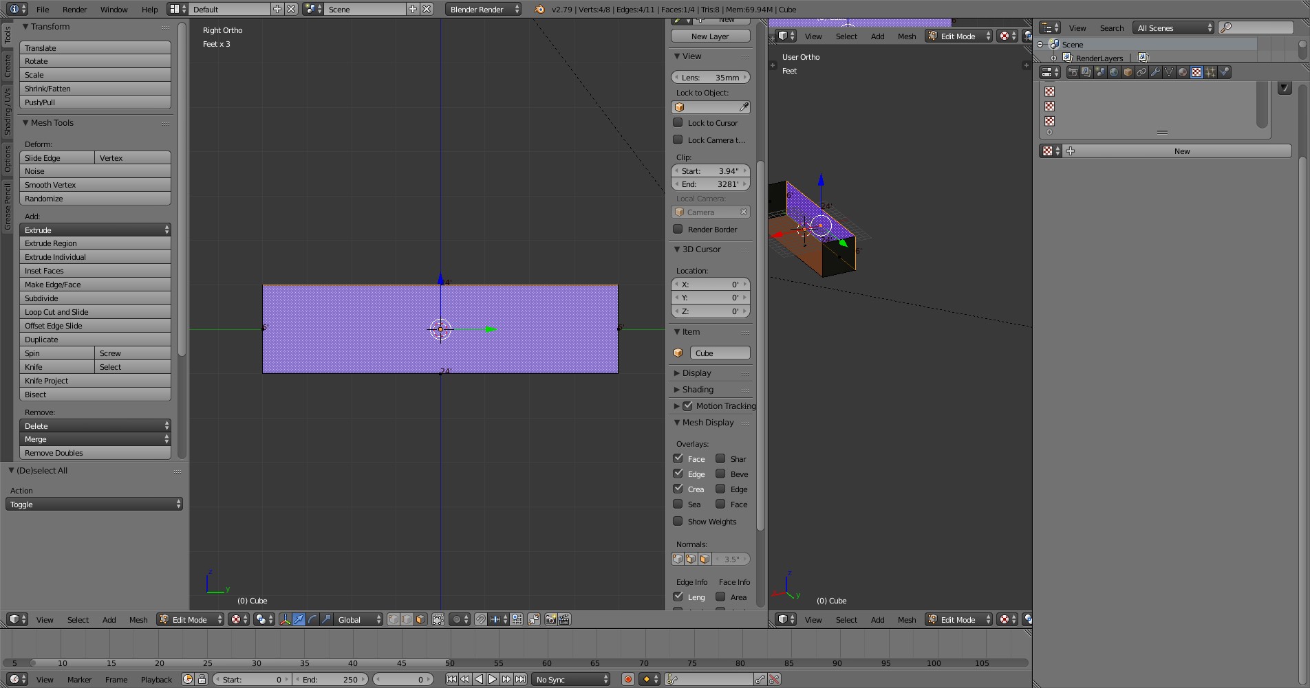
Press U and select Project from view (Bounds). Open up UV/Image Editor in another Window.
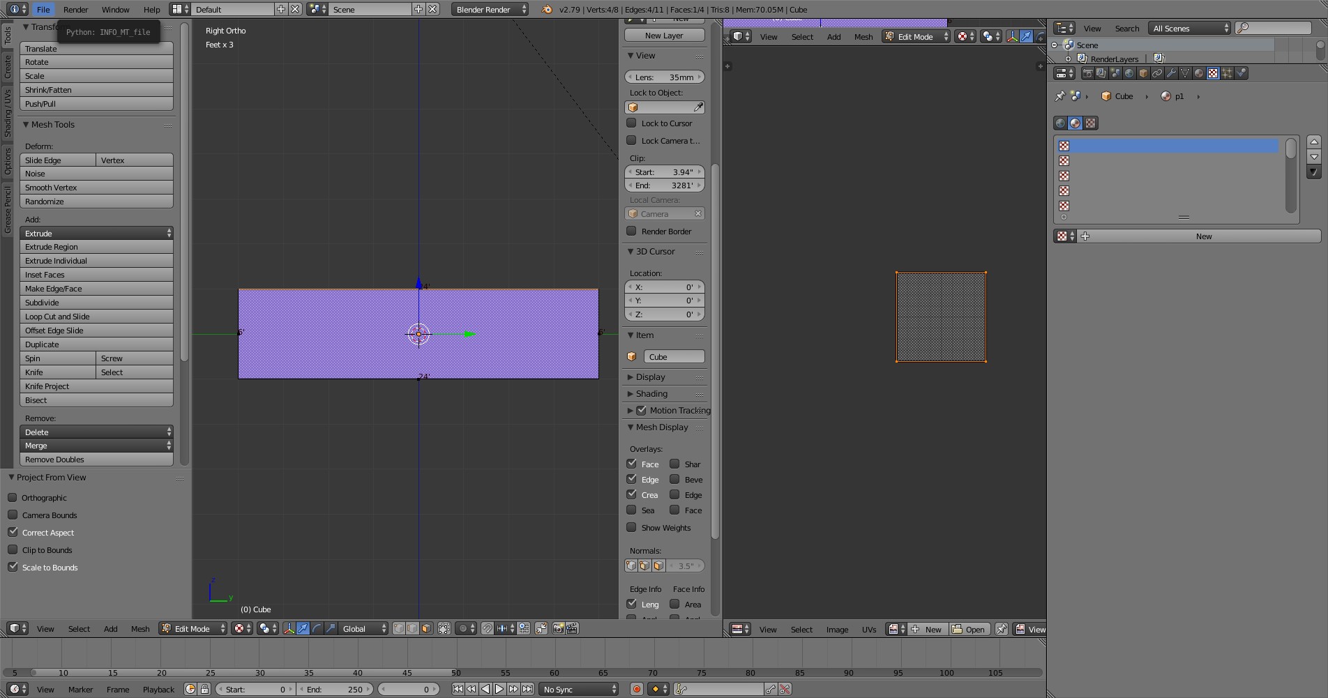
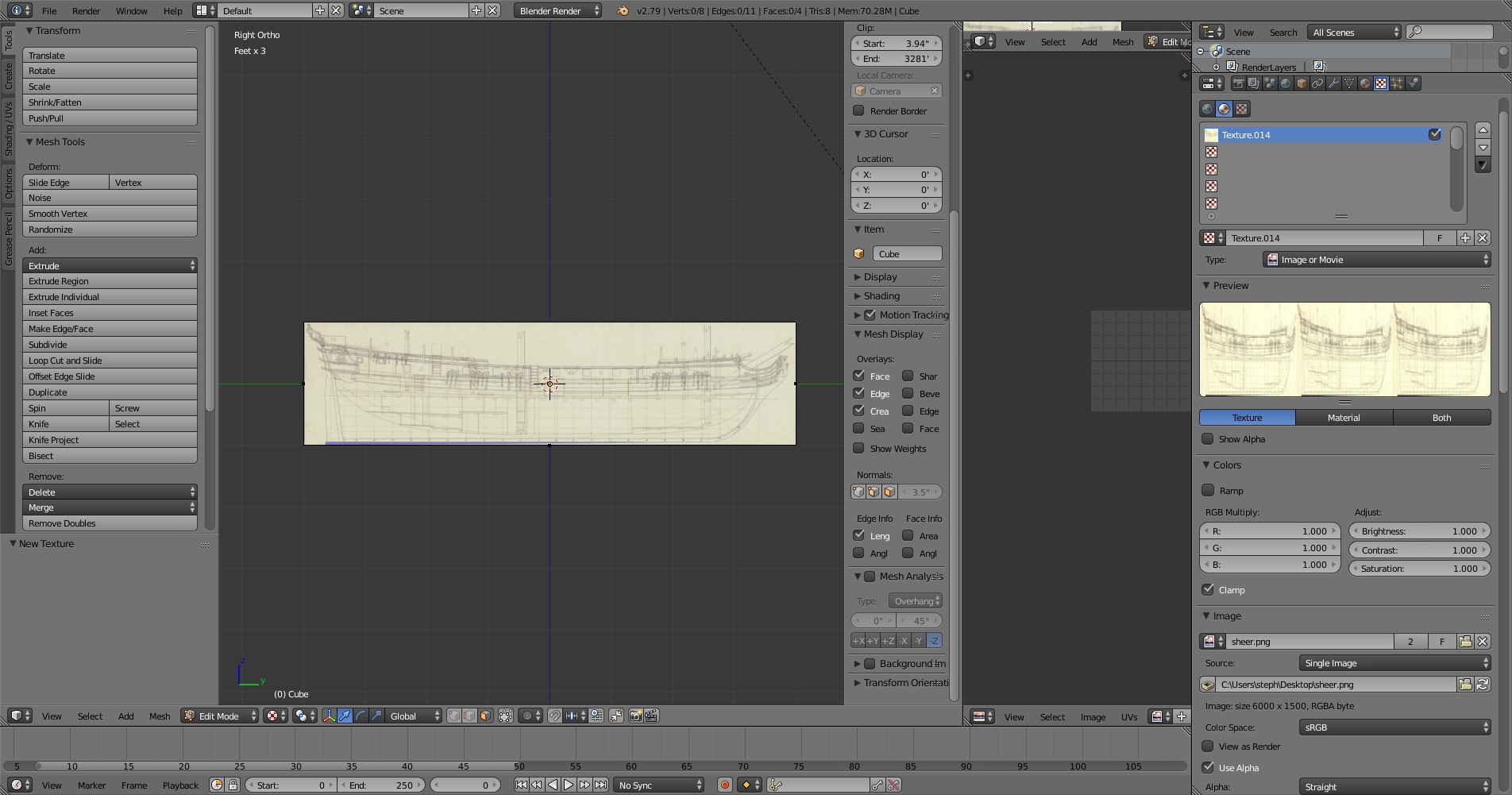
Go to the texture tab, select New, then Image -> Open and select your image (the sheer plan is my case).
This should be the result:
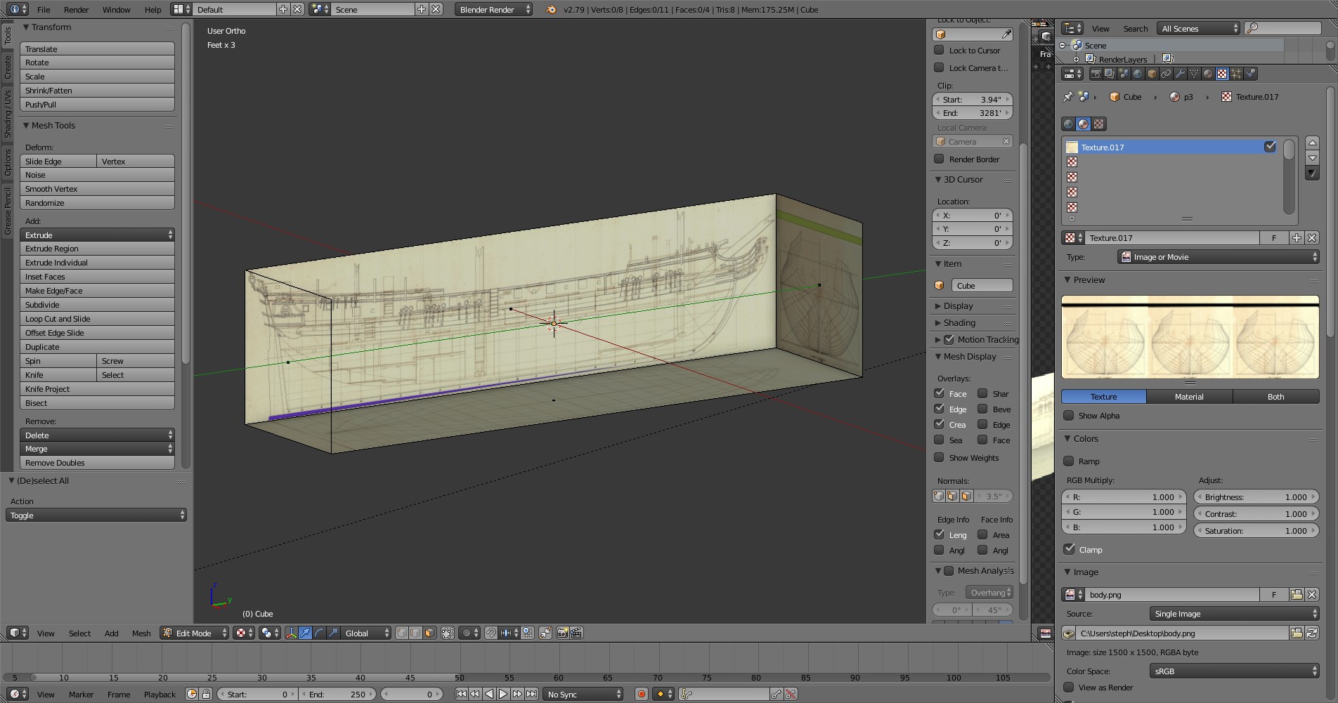
Repeat this for the other views/images:
Now it´s time to make some virtual sawdust

I´ll take a ship I´ve already modeled as base for this tutorial, the frégate légère La Panthère (HMS Amazon in british service) of 1744.
Part 1: Research
The first thing you want to do if you found an interesting ship you want to model is to find as many background information on it as possible because it makes the actual modelling much easier.
In my case, I found a plan of La Panthère in Boudriot´s 'History of the French Frigate'. It´s not the original french plan (which sadly doesn´t exist anymore according to CATALOGUE DES PLANS DE BÂTIMENTS À VOILES CONSERVÉS DANS LES ARCHIVES DE LA MARINE, probably destroyed by the disastrous fire in the Brest dockyards in 1742), but the plan the british made when they took off their lines after her capture in 1745:

The original plan would have been better, as 'as taken off' plans sometimes contain errors. For example, the british plan for La Renommée shows more tumblehome than the original french plan, probably because the thickness of the whales wasn´t properly subtracted when the frames of the body plan were drawn.
So, we got the plan from the NMM, now we look for other sources, the best sites are https://digitaltmuseum.se, Maritiem Digitaal NL and Databasen / https://www.sa.dk/ao-soegesider/da/other/other-collection/40.
I was pretty lucky as all three of them have a copy of the british plan of 1745, so I could check each plan for distortions/inaccuracies etc.
As it turned out, the plan from the danish archives was the best:

It has a few oddities, but more on that later.
So, next stop: more research
Sister ships, date of launch designer/constructor, dimensions (very important for scaling in a modelling app), service history etc.
The best site for the first basic research on a ship is threedecks.org. It shows two entries, one for La Panthère and one for HMS Amazon. I have a danish copy without a scale of the british plan, so I checked the dimensions of Amazon to see if the numbers on the plan are correct:
length p/p 115' 6''
breadth moulded 31'
depth in hold 10' 2''
The numbers seem to be identical (I also checked the source for the dimensions, British Warships in the Age of Sail 1714 - 1792, just to be safe
Next I searched threedecks for other ships built at Brest at the time between 1740 and 1750 and which are roughly comparable in size. This brought up ten ships, the most important ones are La Renommée and L' Aramante because there two detailed monographs available about these ships which would be incredibly useful for stuff which isn´t shown on the plan like masts, interior, paint scheme, deck layout etc. And monographs also mean that there´s a high probability that there are models which can be used as further references.
This is especially crucial in my case, as I haven´t found any contemporary depictions of La Panthère/Amazon (paintings, drawings, models) which would have been a very important guideline for the modelling process.
My next research step, the (service) history of the ship, isn´t that interesting for this tutorial, so I´ll skip that.
Part 2: Preparing the plans in an image editor
Now comes the interesting (and most tedious) part. I´m using GIMP for this kind of work, but any decent image editor would do.
First, we have to determine which lines have to be 'straight' (or better, parallel to the borders of the image), so we can rotate the image accordingly if they aren´t.

The red lines (the center of the bodyplan, the center of the half breadth with the waterlines, the perpendiculars fore and aft and the station lines) should be straight on any plan. If they aren´t, you have to rotate the image (GIMP shortcut: shift + R).
Only one of the green lines ( waterline and keel) can be perpendicular to the station lines (except if there´s no difference between the draught fore and aft, but those cases are exceptionally rare)
Let´s have a closer look if the lines are straight of if we have to correct the image. First the body plan:

The blue lines are a nice visual aid (called 'guide' in GIMP) which can be accessed by left-clicking (and holding) on the pixel-scale at the top and the left of the window.
As you can see, the center line of the body plan is slightly off, so we have to correct that. To do so, we select the body plan (R), then we cut and paste the selection.
In the the layer window, we right-click the 'floating selection' and select 'to new layer'. Now we've created an new layer that can be moved/scaled/rotated independently from the rest of the image.
Pressing R will bring up the rotate window:

Looks much better after rotating:

The keel also is slightly off:

We select the sheer (the side view of the ship) and repeat the procedure we did with the body plan: select, cut, paste, rotate.
The same goes for the half breadth.
Now that the lines that should be straight actually are straight, we have to bring the body plan on the same level as the sheer (shortcut: M to move a layer)

I used the dotted line (which shows the inside of the planking) over the keel on the sheer to align the body plan with the sheer.
Edit:
Jeeeee, I almost forgot one of the most important parts: CHECK YOUR PLAN FOR DISTORTIONS!
First, we'll have a look at the sheer and half breadth.

Drop a guide an every station line, and measure the distance between them. It should be roughly same for every part between the two purple lines (expect for the two in the middle).
My measurements vary between 223 pixels and 225, which is really good considering the plan is over 250 years old. The sheer seems to be okay.
Next, the body plan:

We measure the distance between the line in the center and the lines at the sides, logically they should be the same. Green line is 678 pixels, red one too.
Excellent *insertMrBurnsgrin*
Then we compare these measurements with the length of the extreme breadth of the half breadth:

I got 677 pixel, which is very much okay
This step is very crucial if you want to model a ship from the Architectura Navalis Mercatoria from chapman.net, as these plans are compressed along the longitudinal axis, so the
red and green lines on the body plan are much shorter than the corresponding lines on the half breadth. Dividing the measurement of the half breadth by the measurement of the body plan gives you
the ratio by which you have to adjust the width of the image.
Part 3: Setting up the plans in an 3D modelling app (Blender)
So, finally, the plan is ready, let´s get it in Blender:
Set up guides to make selecting the various parts of the image easier and more exact (the select tool snaps to the borders of the guides). Corresponding colours should have the same length, the blue line should should be have as long as the red one.

The red part for the body plan is 1500x1500, sheer 6000x1500 and half breadth 6000x750.
Now it´s just a matter of selecting the various parts and pasting them as a new image. Only the half breadth requires additional steps.
This is how it should look like:

Go to the image tab and select canvas size. Double the height and move down the image in the preview picture.
It should look like this:
Then press ctrl+A, right click and select copy, right click again and select paste as..., then select new layer (not paste or paste into!).
This the result:
Almost there...now go to the layer tab, select transform ---> Flip vertically. Et voila:

BLENDERTIME!
Open up a new scene and select the cube, go to edit mode and select length in the mesh display/ length info.
We have a length/width picture ratio of 4:1 (6000x1500 pixels), so we have to adjust the length of the cube to 24'. Then we delete the top and the right side of the cube and invert the faces:
Then we assign a material to each remaining side of the object.
Select one face and press the corresponding view shortcut on the numpad to have a direct view on it:
Press U and select Project from view (Bounds). Open up UV/Image Editor in another Window.
Go to the texture tab, select New, then Image -> Open and select your image (the sheer plan is my case).
This should be the result:
Repeat this for the other views/images:
Now it´s time to make some virtual sawdust


